Could've Been Bike Shorts...

"You could always make bike shorts if your idea doesn't work out."

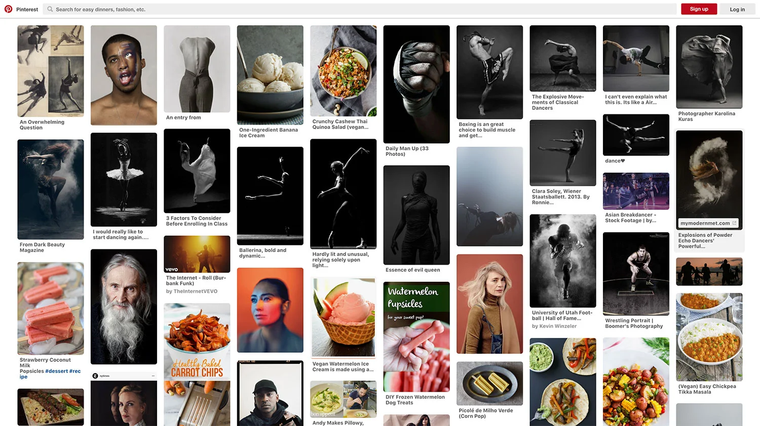
To the nice lady at the craft store who sold me a couple yards of Spandex: Thanks for not tripping out when I showed you some weird reference images on Pinterest and then asked me to come back later to show what I ended up making.

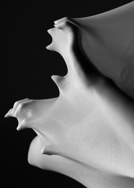
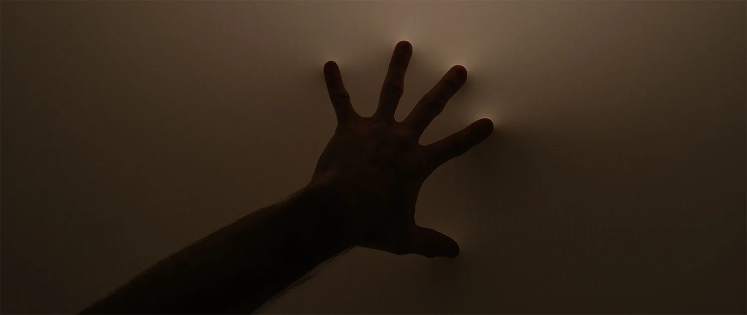
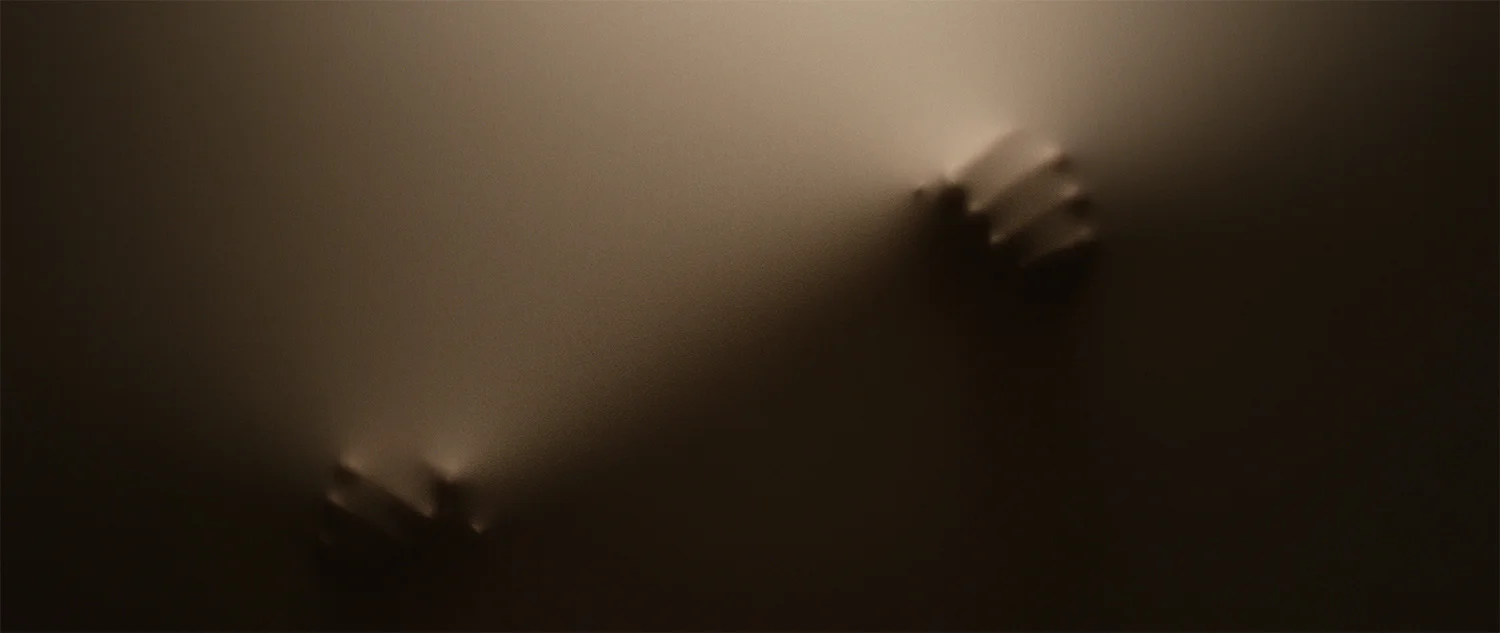
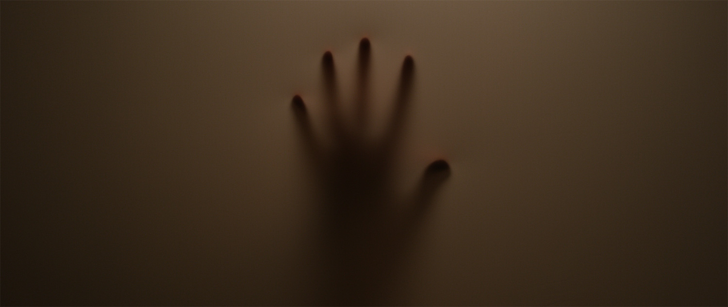
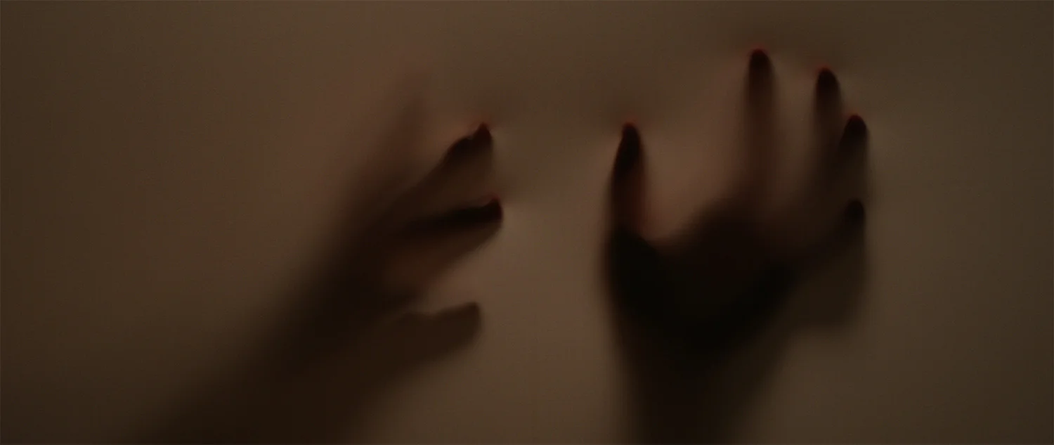
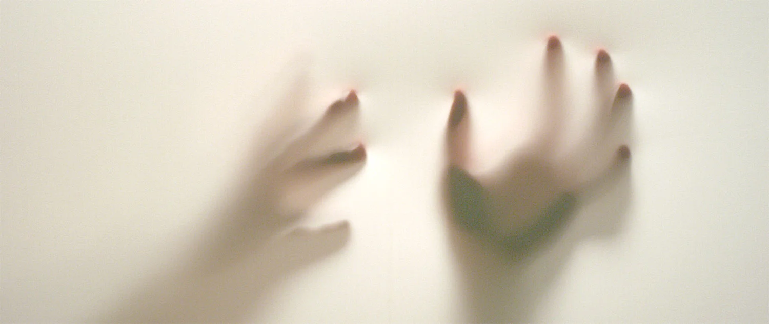
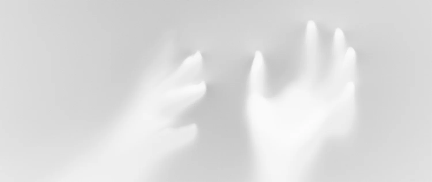
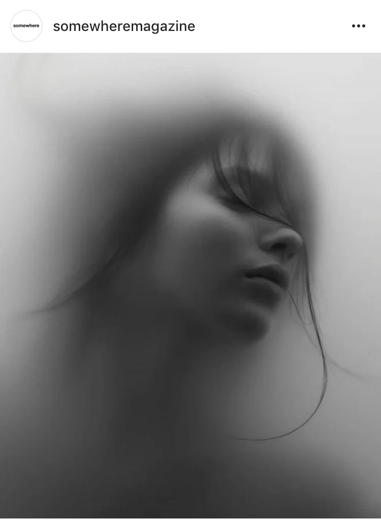
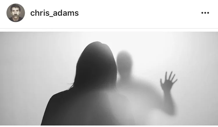
So yeah, this one went super dark and ghostly. Like the way these things normally start off, I'd been sitting on a handful of reference images and used them as a starting point to make something; I'm suuuper interested in selective focus and in-camera effects.

Footage from this film is available for licensing over at Filmsupply.

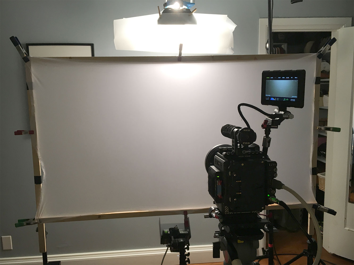
The internet told me I'd need to shoot through some kind of transparent layer, so I started experimenting with different types of plastic diffusion and fabrics. I was looking for something translucent that would look interesting on camera when you touched it. A trip to an arts and crafts store had me finding a couple different types of Spandex that were on sale. Figured I'd need a frame to stretch the fabric to keep it taught, so it was off to Home Depot to spend like $3 on two 1" x .5" x 8' pieces of cheap lumber. I used screws to keep the pieces together and attached the Spandex using spring clips.

IMG_7938web.jpg

Once I got the framed fabric and my camera set up, it took a bit of experimenting before I finally landed on a look. I'd bought both white and black versions of Spandex and tried out each one individually as well as layering them. The white looked more interesting with the lighting and how the shadows worked. Having the black layered behind the white kept the setup from being translucent.

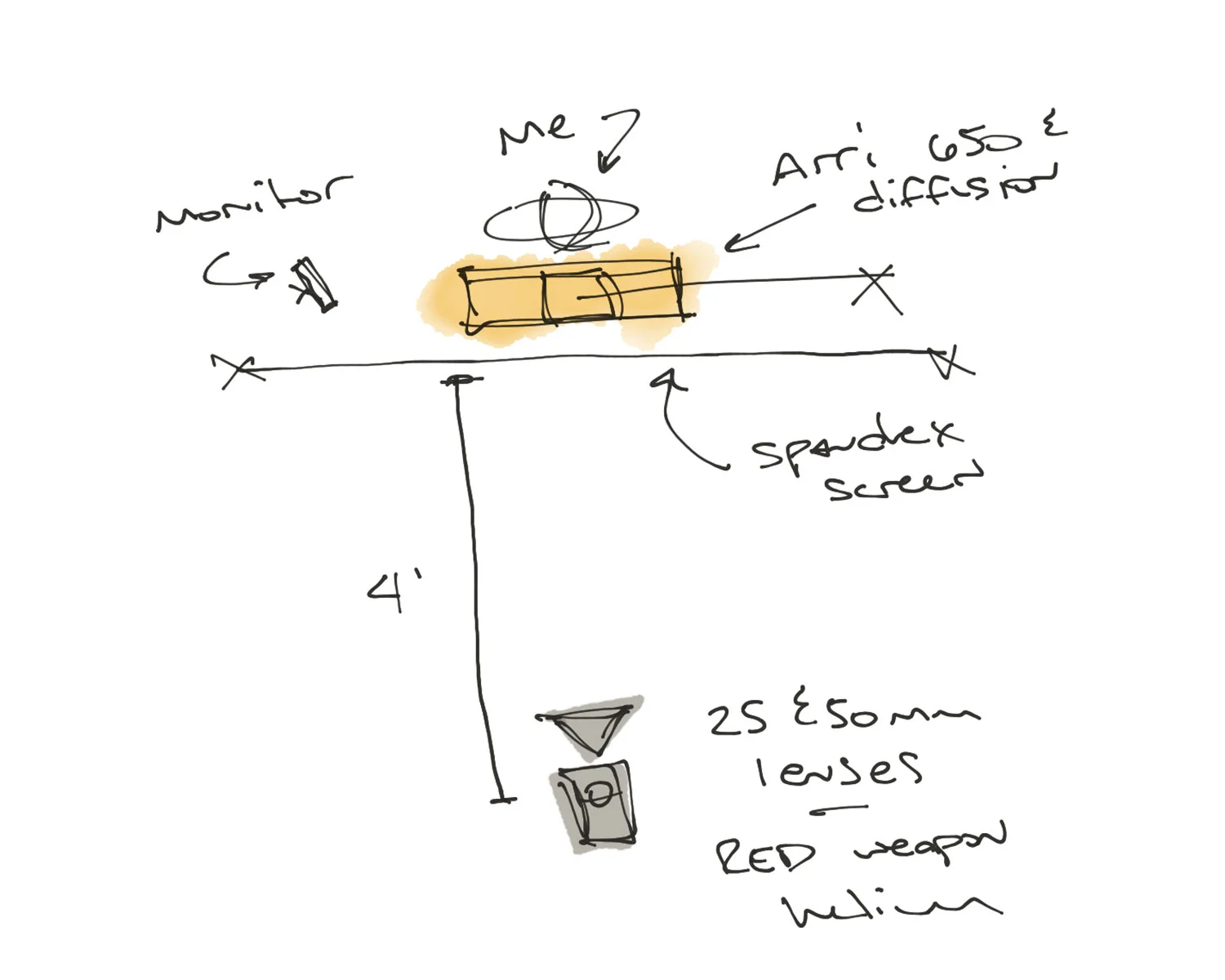
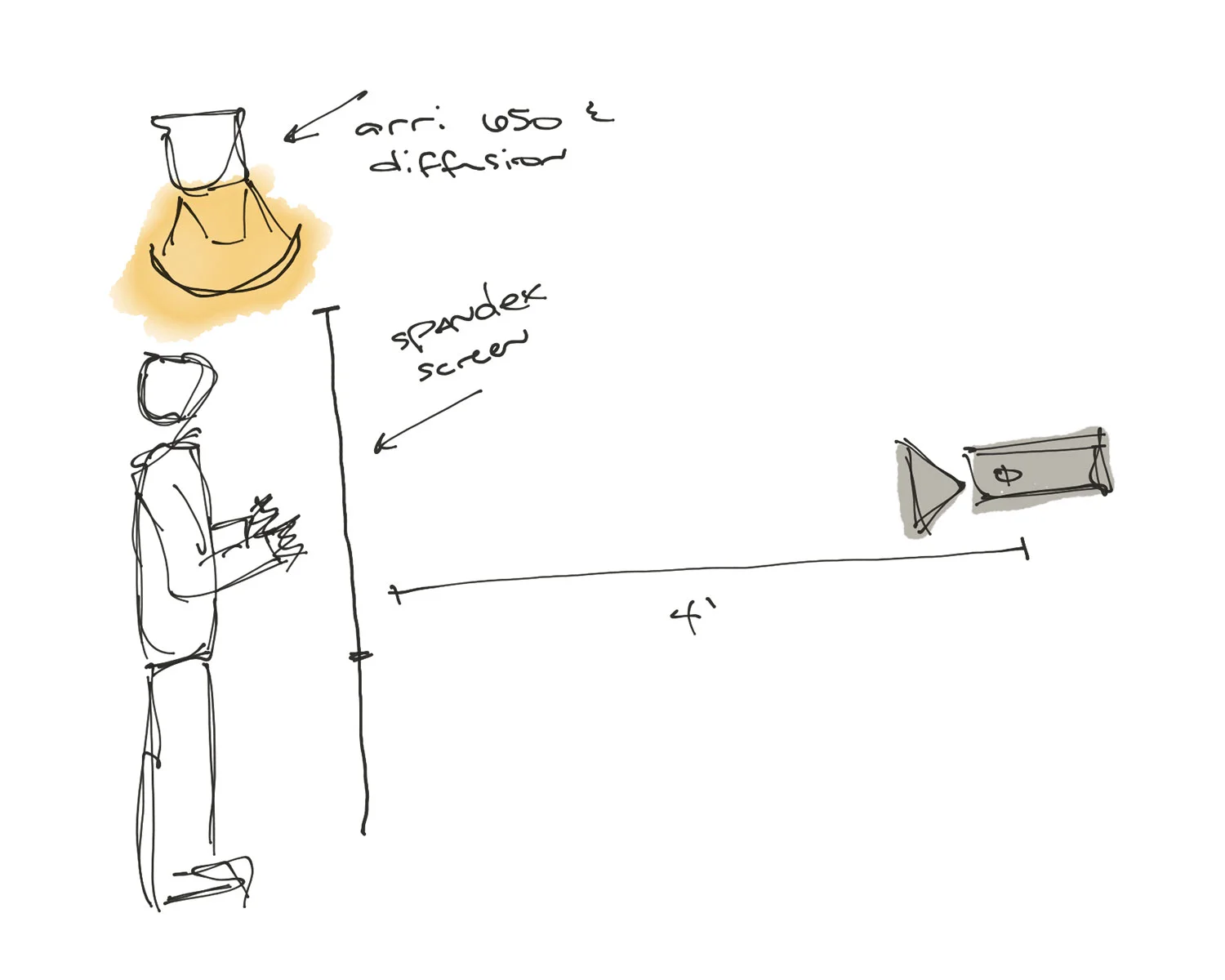
Initially, I had the lighting setup on camera right with no diffusion and in front of the fabric. That made for some interesting-looking long shadows on camera as I touched the Spandex screen, but wasn't the look I wanted. With how I pictured the edit and knowing I'd never be able to reproduce the light-to-dark gradient across the screen, I moved the light above the frame but still front-lighting the fabric. Most of the reference images I had were backlit, but I wasn't able to reproduce that look with how small a space I was using. Moving the overhead light just behind the fabric worked for the space I had and gave me the look I wanted. I didn't use any of the footage with my hands in front of the backlit fabric, but it still made for some interesting-looking imagery as the light interacted with the fabric stretching the other direction.

A monitor tethered to the camera allowed me to see what I was doing as I was interacting with the fabric. The initial imagery I was getting looked super dark and ghostly and reminded me of a Nine Inch Nails track I'd heard from an interview with Trent Reznor and Atticus Ross on the Song Exploder podcastI'd highly recommend checking it out if you've not heard it already.

The initial test footage was shot at 48 frames/second but was still too fast for the look I wanted. 60 frames/second didn't work either, so I lowered my camera resolution from 8k to 6k widescreen so I could get to 99.9 frames/second on my RED Weapon Helium. The movement speed looked right, but I ran into flicker issues with the lighting and 180° shutter. The FLICKERfree iPhone app fixed that by letting me know I needed a 299.7° shutter angle. Thanks internet...

Another unexpected result from the testing was how flexible the look was once I got it into post – obviously though working with a high-end camera and raw .r3d files doesn't hurt. My reference images were black and white, but after experimenting with different color temperatures I again fell in love with shooting with tungsten lighting on a white background at 4500k. Neither the blacks nor whites were being clipped in the raw .r3d files so there was still all the color information to use in post. I kept the in-camera dark and ghostly look for this edit and didn't do any color correction or grading, but can easily imagine other possibilities with this footage.
After 8pm

St. Anne the Wife and I have two kids: one is 5 years old, and the other is 11 months. Turns out neither of them can be trusted to cook, bathe, and/or get themselves ready for bed on their own, so we pretty much close up shop after 6pm for family stuff. By the time we get those two tiny humans fed, cleaned up, and to sleep, Anne and I basically collapse from the day only to get up the next morning to start all over.

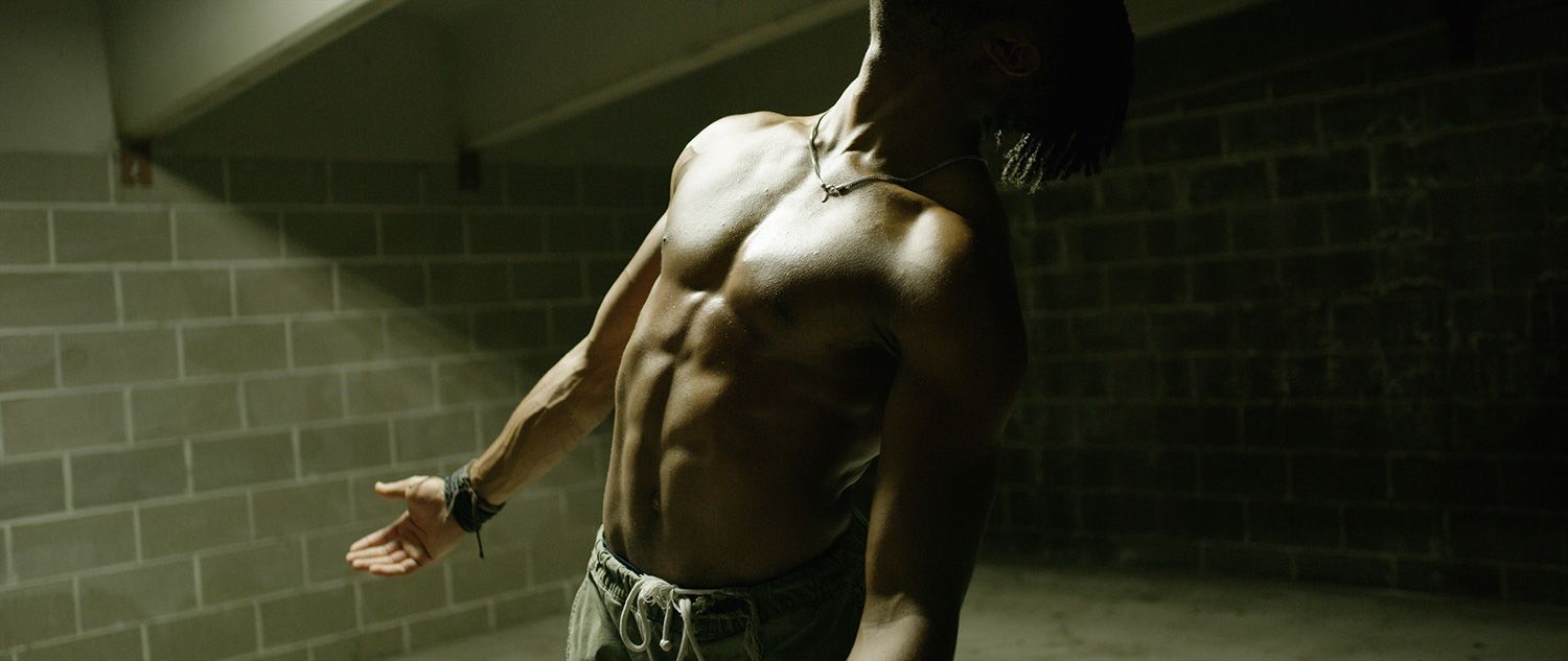
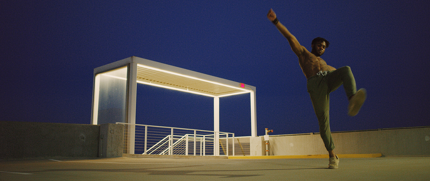
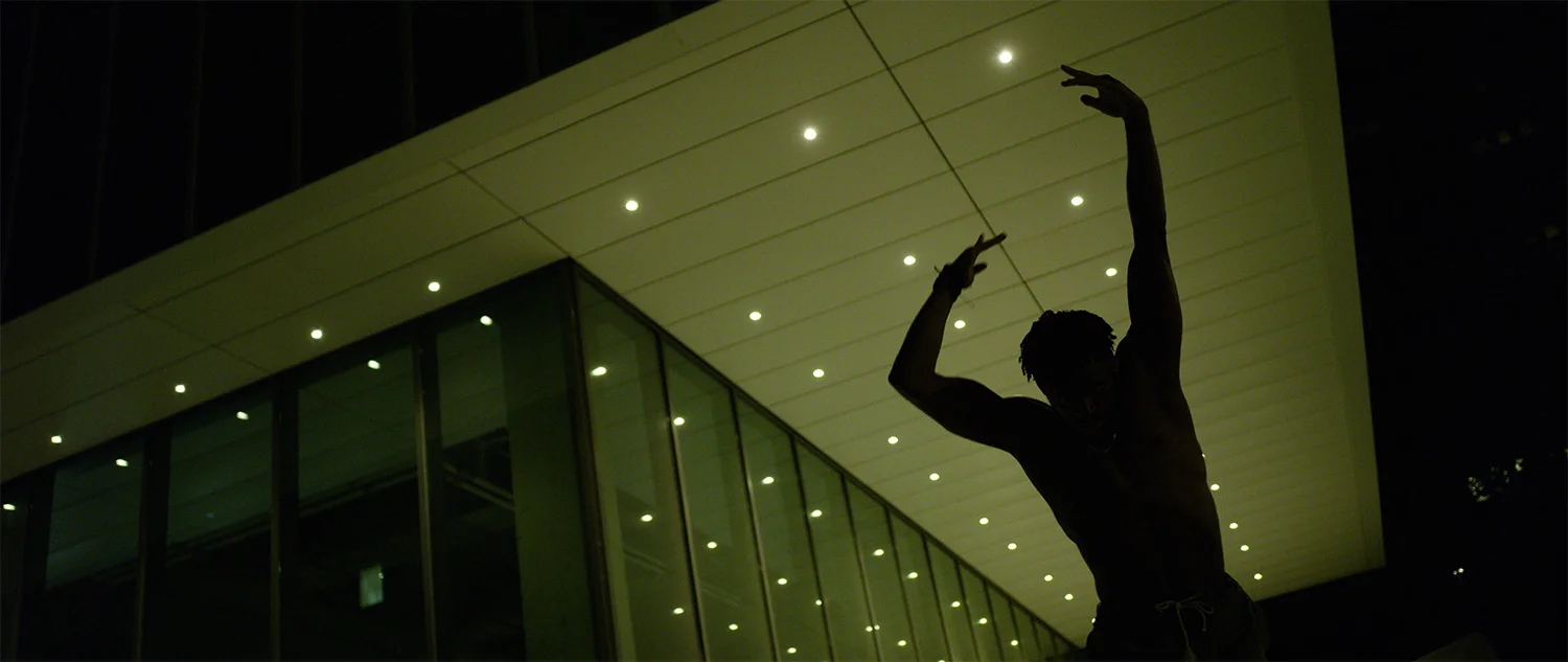
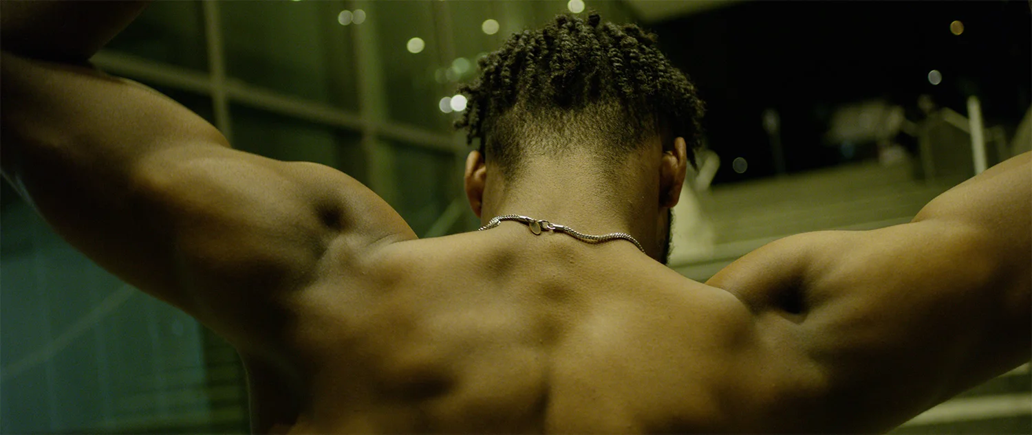
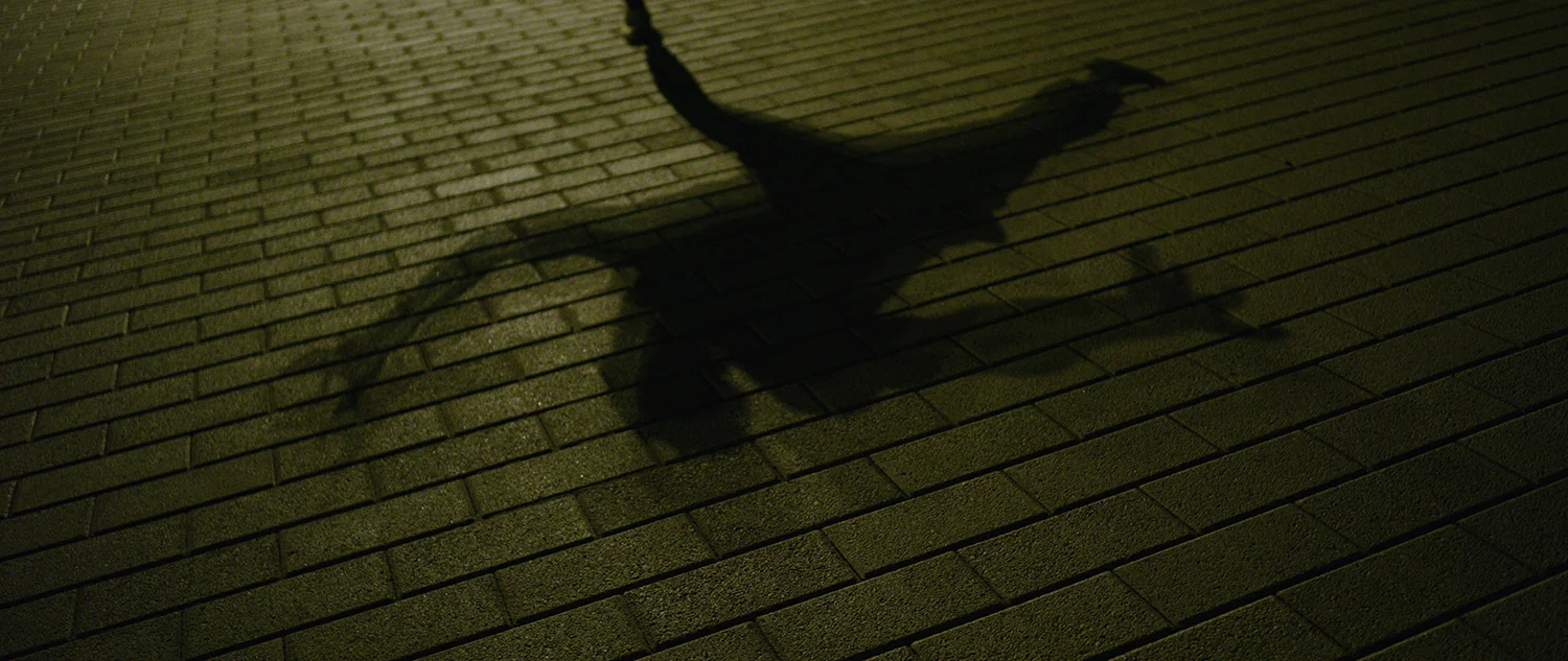
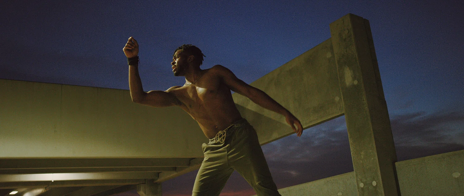
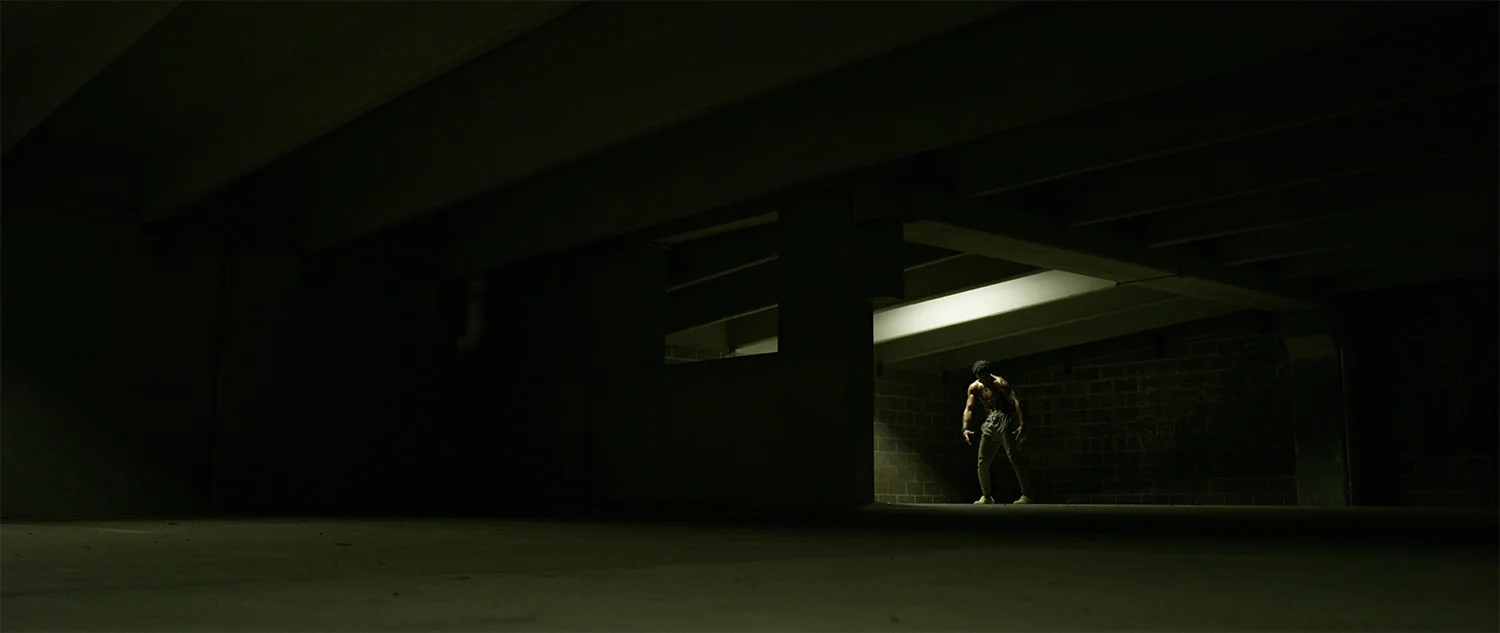
A couple weeks ago, St. Anne and The Boys were out of town for a few days and I made it a point to be out after 8pm. That's a freakin' double rainbow covered in unicorns around here, so I lined up a shoot with an absolute BEAST of a dancer I met through Instagram named Emmett Prince. He's a dance student at the University of Central Oklahoma and was up to shoot around downtown Oklahoma City after dark with a couple complete strangers.

Somehow I also wrangled another two filmmaker buddies of mine to help out on our shoot: John Dewberry is a saint and a kick-arse AC; Steve Mathis's last real jobs were gaffing Black Panther and Thor: Ragnarok, so he basically just puts up with me. As per usual, the footage from this film is available for licensing over at Filmsupply.

In getting all this nonsense together, I had a couple key reference images and videos plus I was listening to a ton of Frank Ocean and Anderson .Paak. There wasn't a proper storyline, but I had the locations in mind and I wanted to work with a black male dancer in his early 20s. If you're up for it, here's the link to download the lookbook as well as the music playlist we used during the shoot.

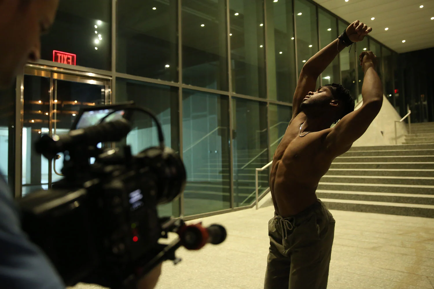
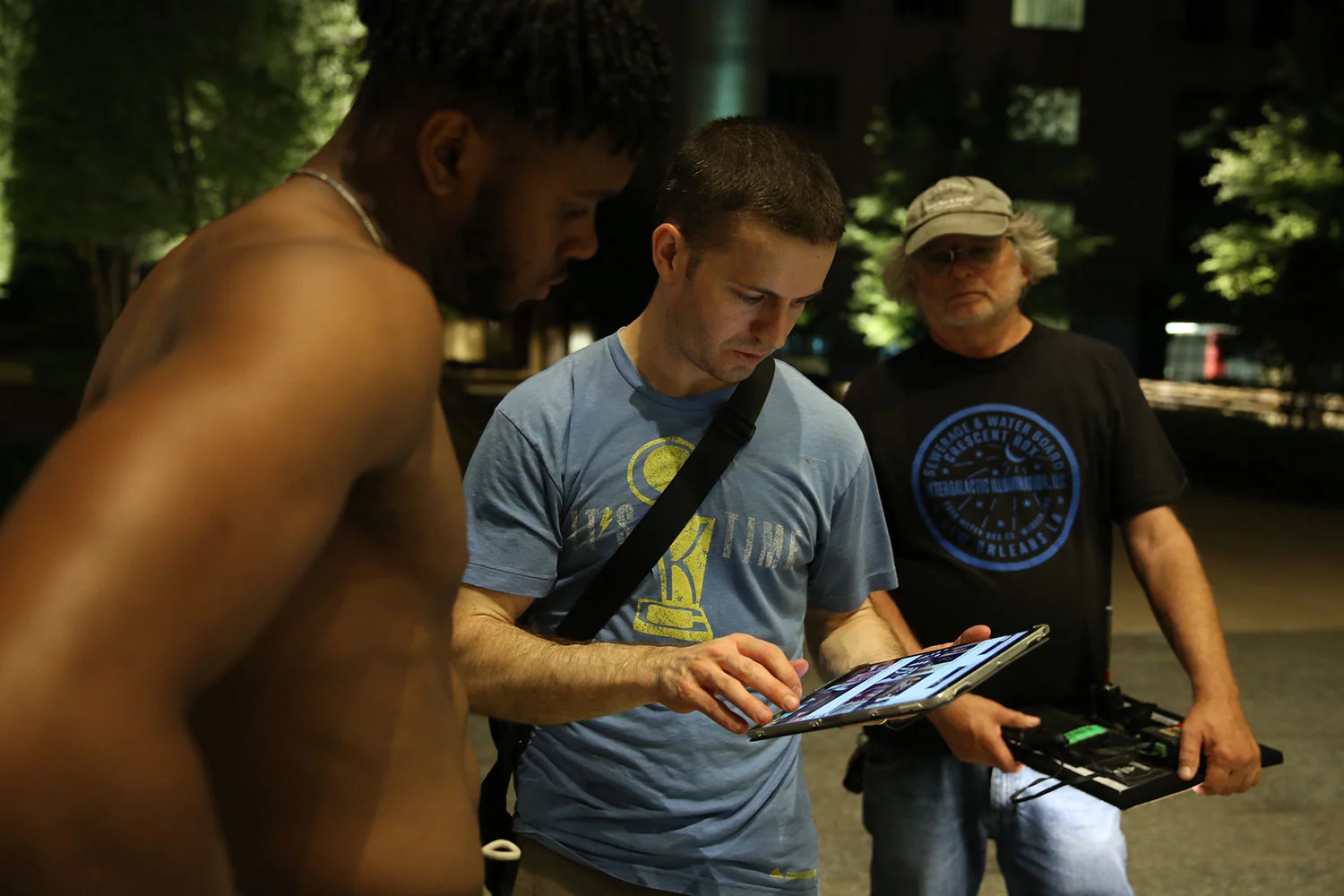
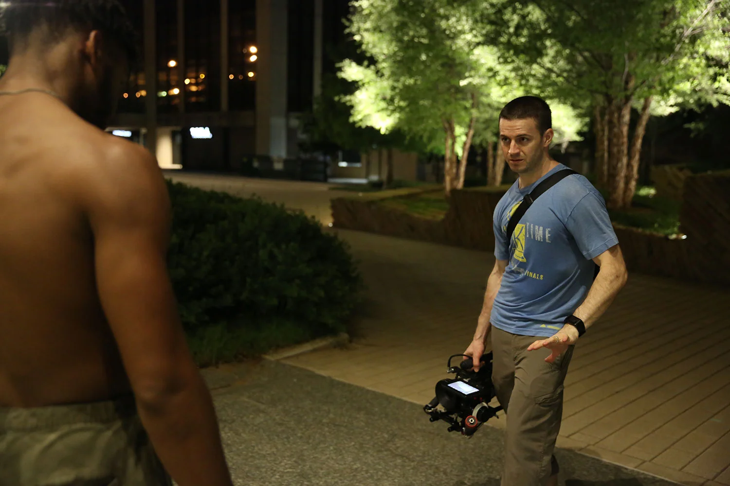
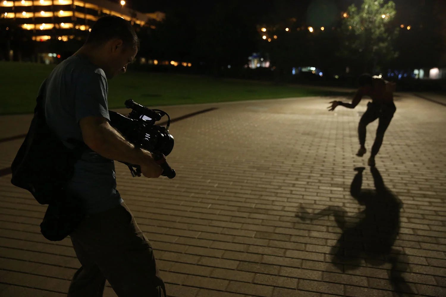
All the nervousness kicked in right before our 8pm call time and I was ready to puke in the parking lot just to get it over with. The three guys on the project were donating their time and I made sure to keep the shoot under two-ish hours total with a round of drinks on me afterwards. I'd scouted earlier in the week and lucked out with all of the locations being pretty close to each other. The look at the first location didn't end up working and we only made it to three of the other five locations I had in mind. The footage we were getting felt right and I had no problem nixing the other two spots so we could keep within the promised time frame. Crazy thanks to John the AC for snapping some behind-the-scenes pics at our last location.

There's always the urge to just throw money at a project and this one was no different. That being said, I didn't have the money to throw at it. And two, I know through personal experience that throwing money at a thing isn't always the best solution. The goal was to shoot this project in a way where I was participating with the talent vs. simply observing them at a distance. This could've been a great situation to break out my Steadicam setup, but I knew I'd need to rent out a wireless follow-focus and monitor package for my AC. An EasyRig would've been IDEAL to balance out a handheld look and not straight-up kill my back, but again I'd need to rent one of those. "No self-respecting Director/DP would go into creative battle without the proper tools," right?

I'd packed my Steadicam but ended up not using it after only a few minutes – the camera angles just weren't right; Thank goodness I didn't drop the money on a wireless follow focus and monitor kit rental. I'm not going to say an EasyRig wouldn't have been helpful, but not shooting with one actually freed me up to try camera angles and movements that I wouldn't have otherwise.

One key piece of additional gear was a battery-powered Bluetooth speaker. I've done shoots with music sputtering out through my iPhone, but the sound quality and volume are passable at best. We used a JBL Flip 4 connected to my phone and it worked like a champ. The burrito-sized speaker was loud enough, sounded great, and the setup was dummy-proof. Either John the AC was holding it or I had it clipped to the small messenger bag I had on me throughout the shoot.

For the gear-heads, we shot with my RED Weapon Helium at 8k widescreen and either 60 or 48 frames/second depending on the light levels. In terms of lensing, my 25mm Zeiss CP.2 emphasized the on-screen talent and his performance but didn't separate him from the locations like a tighter lens would. I swear if I were forced to choose between a 25mm lens or food and water, I'd still pick food and water but I'd have to think about it for a minute.

We were shooting with existing light at each location, so we tested to make sure we weren't getting a flicker fight between shutter speeds and the light fixtures. The first two locations had no beef with a typical 180° shutter, but at one point we had to break out John's FLICKERfree Calculator app and adjust accordingly.

Knowing that we'd be dealing with lower light levels, I evicted the Standard OLPF that's set up camp in my RED for the Low Light version. It’s the first time I'd used it so I made sure to check out test footage online beforehand – which for the most part ended up being a waste of time. There are very few situations where I'd use the Skin Tone-Highlight OLPF, but I feel like the Low Light optimized version helped to give me just a bit more light, especially with my T2.1 lens and shooting around ISO 1600-2000 on the high-end. All of this footage is straight out of camera BTW using RED's RedGamma 4 / Dragon Color 2 look – which I absolutely dig. Given the opportunity, I'd love to see what a qualified colorist could do with the raw .r3d files.

DIRECTOR, CAMERA, & EDITOR - me
FEATURING - Emmett Prince
CAMERA ASSISTANT - John Dewberry
GAFFER - Steve Mathis
MUSIC - "White" by tiedy ky

Sources Sources Everywhere

I'm assuming part of being a creative is constantly feeding your reference bank so you'll have something to pull from when you're making stuff yourself. Without some kind of reference, inspiration, or source, I'm more than likely just going to keep doing whatever it is I'm already doing. I'm probably also not likely to grow or improve.

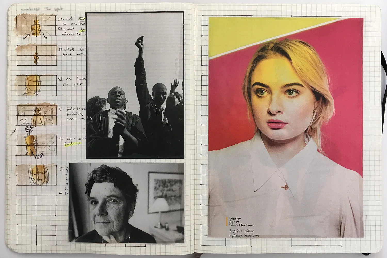
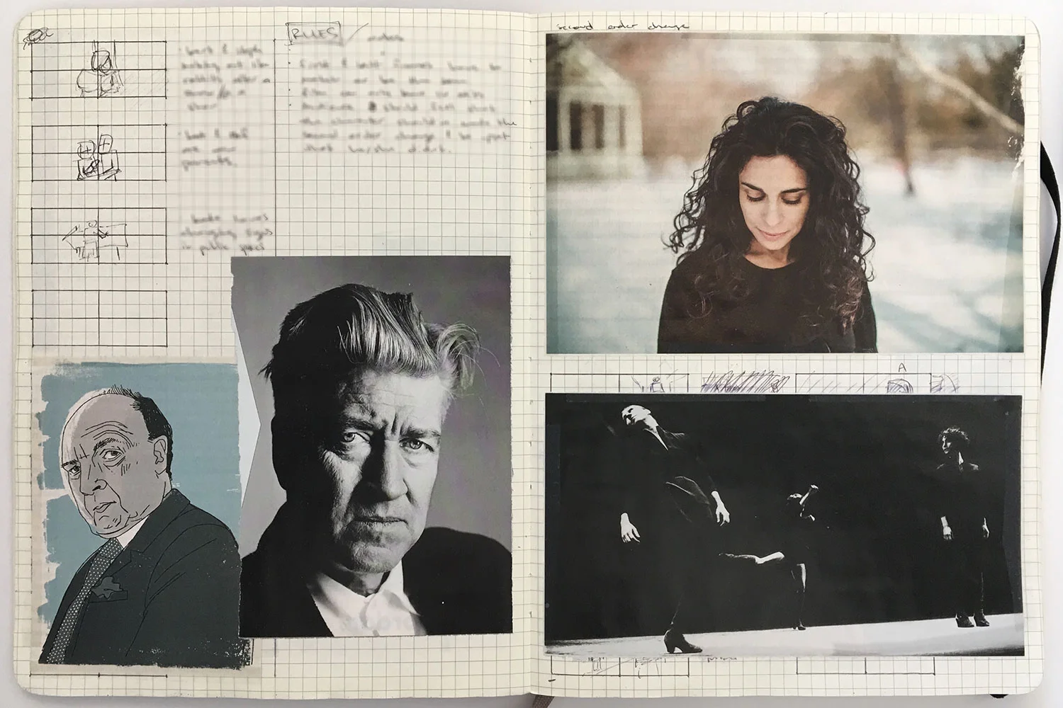
Years ago I had a notebook where I'd take an image from a newspaper or magazine, paste/tape it to a page, and then write a short story or even just a couple paragraphs about who/what was in the image and/or how it made me feel. There was ABSOLUTELY nothing profound about it or anything I wrote, but it was a fantastic practice for the kind of work and projects I'm passionate about today. Obviously, the internet has changed just about everything, so now I collect references in both digital formats and physical notebooks and draw from those sources and ideas for new projects.

IMG_7670web.jpg

Pinterest and Instagram seem to be my major sources for interesting and inspiring imagery online. I subscribe to the print edition of The New Yorker and try to read a good deal of the articles each week, but I primarily keep my subscription for the photos. I'm also constantly pulling screenshots from videos as well as anything else I see on the internet, in print, and in person that looks interesting and set it aside to hopefully use down the road.

It's always great to see new work from people you admire and be able to link their imagery to other stuff you've seen. It's also hella boring to keep seeing visual trends after they've run their course – I'm looking at you 2009-11 and all your DSLR bokeh tests. I'm praying the "I only shoot film cameras" and "let's only shoot with super colorful Quasar Tubes and Sky Panels" trends wrap up soon. I'll fight you though if you start talking crap about my lens flares... They're freakin' beautiful.

I'm constantly curating my Instagram account and following the rabbit holes I come across. I'm pretty sure they led me to my regular rotation of sites like LensCulture, BOOOOOOOM!, Colossal, It's Nice That, and who knows how many others.

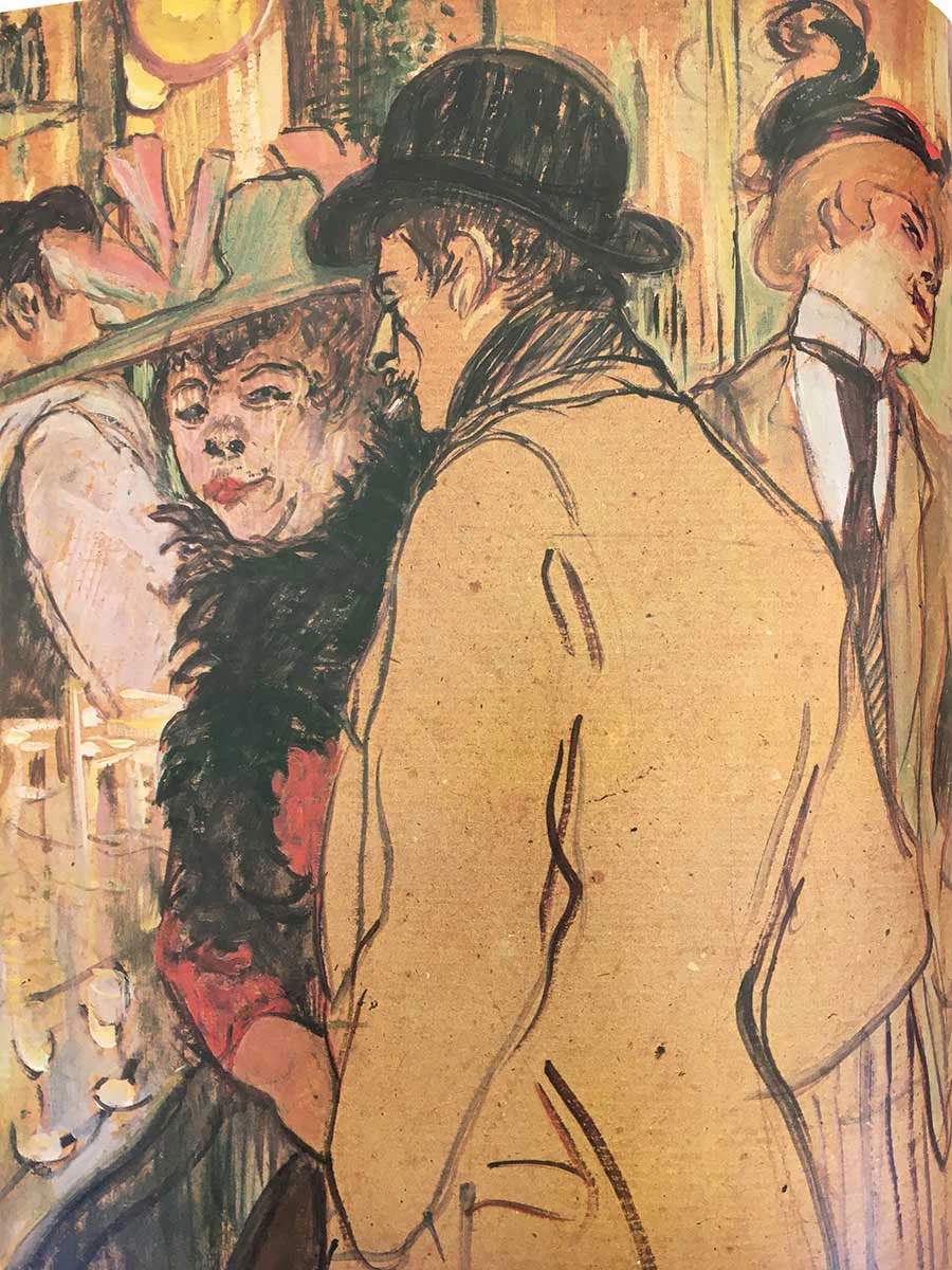
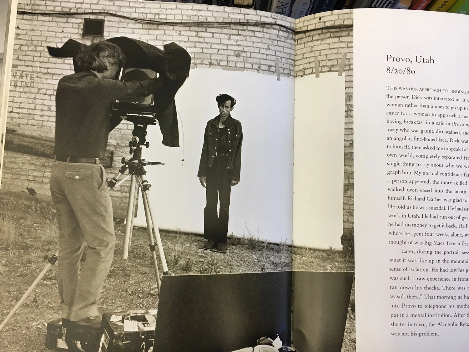
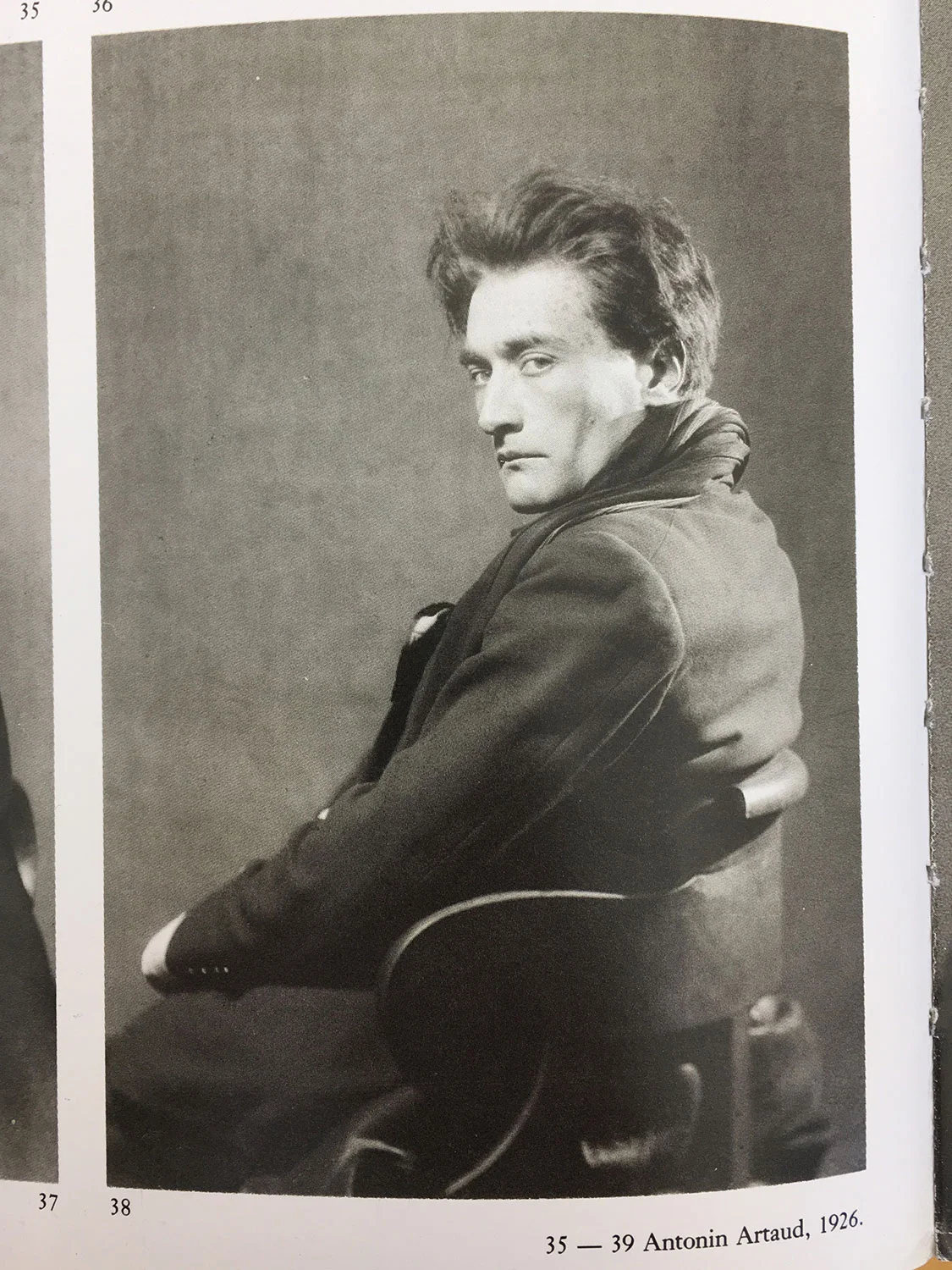
More and more though I'm intentionally looking for inspiration that's outside my normal online sources. Older photography and art books at the public library are a freakin' gold mine. It's incredibly refreshing to stumble across interesting work that's not suggested by some algorithm. I'll just take a picture with my phone and file it away with the others.

IMG_7585web.jpg

Monsters and Night Scouts

Anne and The Boys are out of town for a few days this week. It's always weird having the house to myself overnight and having even a short respite from parental responsibilities. I joke about Anne being the family quarterback and me being the JV waterboy, but she NO DOUBT runs the parent show around these parts. That being said, not running the dinner service, being wrist-deep in the day's dirty bottles, and coercing two small children to go the f**k to sleep, I made the most of last night and was out before, during, and after dusk like some kind of monster.

The better three-quarters of my family are off visiting relatives with her mom. They're planners – and better than me – so they arranged their trip while I was working the deadCenter Film Festival this week. If you're up for it, go watch what on-camera talent Katie Parker and I put together for them last year.

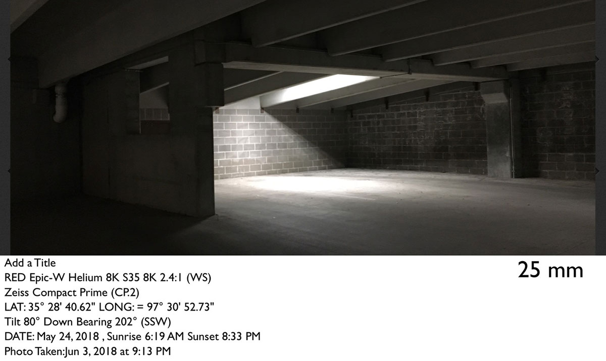
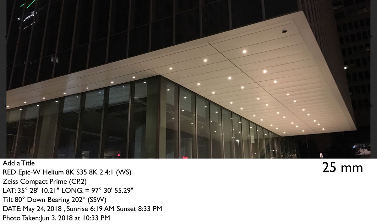
I was also out last night scouting for another small personal project shooting this week. For scouts, I'm normally out with my Canon 5D Mark III & 24-70 lens kit plus the Artemis app on my iPhone. The DSLR is out there because the images are better and I can do more with the camera, but having an iPhone app that will show the aspect ratio with a specific camera, resolution, and lens is incredibly helpful in prep. Sidenote: I promise I shot these last night; The app dates are off.

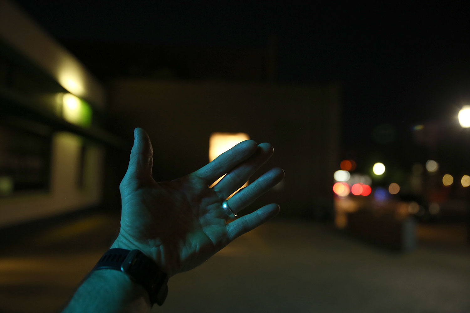
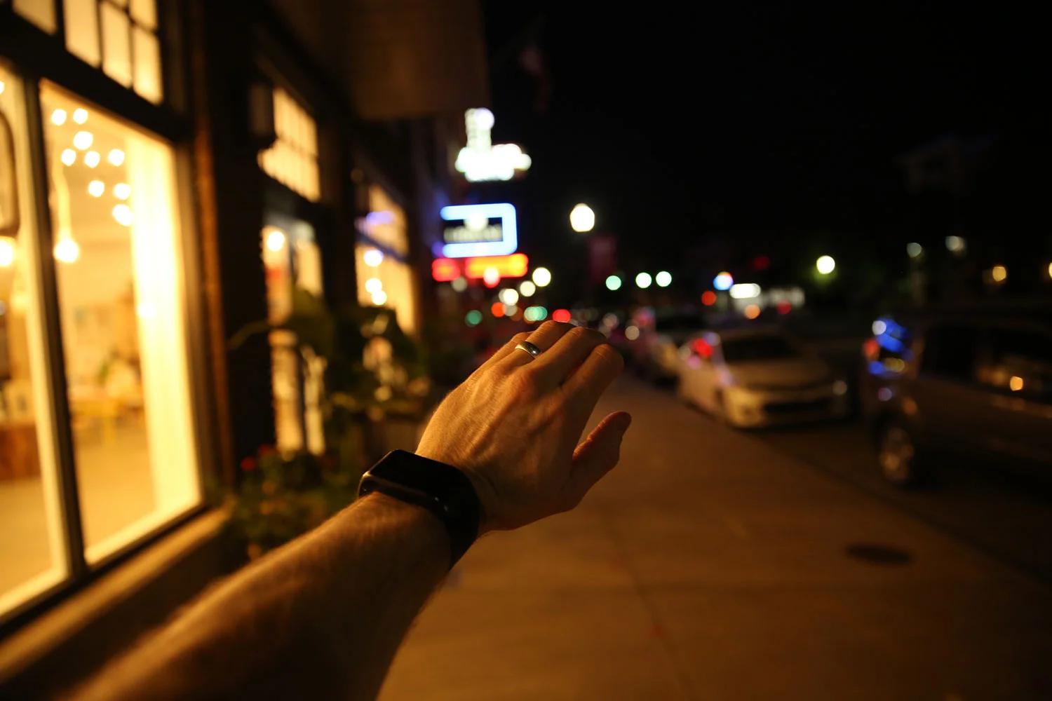
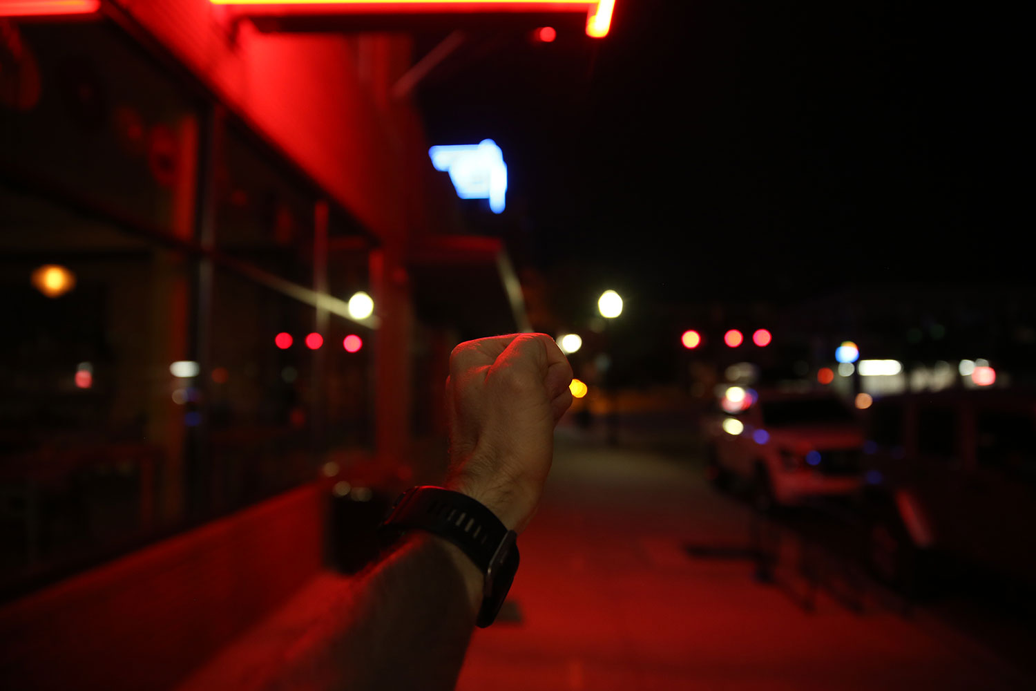
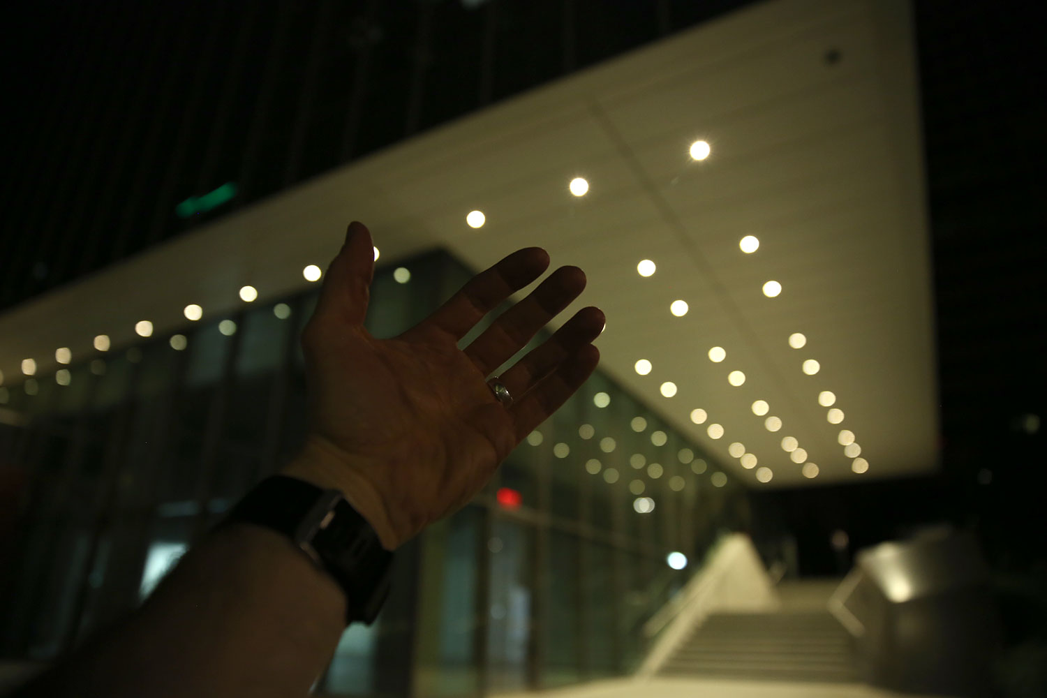
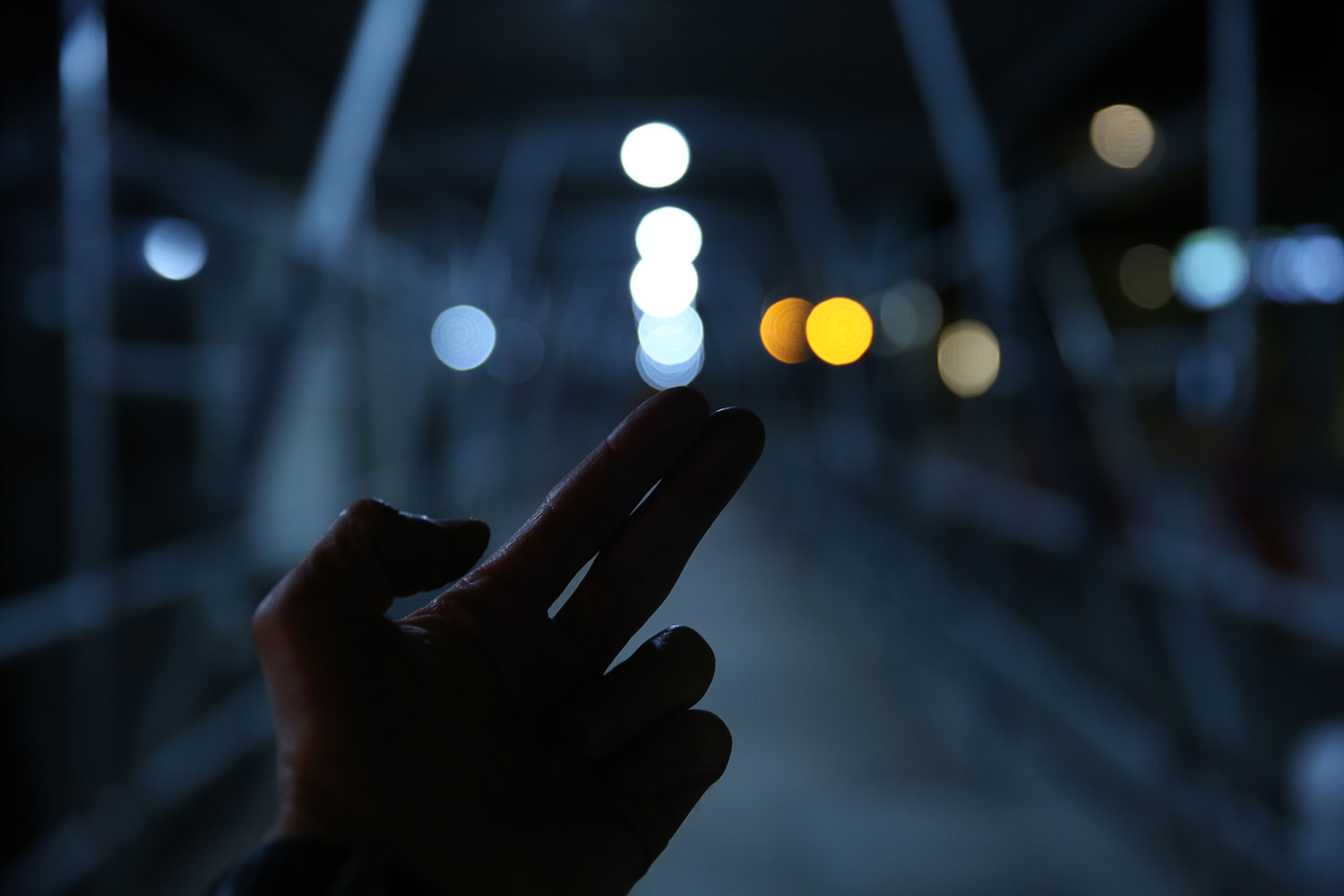
If I'm out by myself, I'll shoot my clenched fist to get an idea of what the light will look like. The knuckles and creases are a quick stand-in for the shapes of the face and eye socket. Lower light levels don't always play nice with my camera's auto-focus, so I'll open my hand up to give it at least a fighting chance. I've also seen people online carrying around black marbles to check for eyelight – but I'm not dealing with that kind of nonsense. Probably should though...

Shooting with Penny Pitchlynn

Meet Penny Pitchlynn. She's a badass. She's the Norman, OK, based musician behind LABRYS, plus she's the bass player in the indie rock band BRONCHO. I also remember her Low Litas days a while back. She reached out a few weeks ago through a buddy of mine and we finally got to work on something together. Have I mentioned I'm always down to make stuff with other creatives? 'Cause I am.

When she reached out I immediately knew I didn't want to shoot something with her playing or an interview about her music projects – there's plenty of solid stuff out there already. I did want to try and play with contrasts though. I'm always a fan of the idea of who we are vs. the person we sometimes need to be. In setting up the shoot, I sent Penny some reference images and an idea of a person being in two different worlds; Kinda like how I feel about being on LinkedIn. Footage from this film is available for licensing over at Filmsupply.

This was also a bit of a shotgun blast in the dark with hopes of hitting something. "Hey, let's try a book light." "Oh I know! Let's shoot white on black and black on white!" "Man, that Vaseline on a clear flat would be cool." "What about shooting through a curved piece of glass to distort the image?" If you're up for it, here's a link to download the look book I put together for the shoot.

Penny had an interesting comment while we were shooting and trying out different techniques and ideas. She mentioned it was kinda like her time in the recording studio and recording with different microphones. There's not always one right way to do something and there's creative value in trying different approaches.

CRAZY thanks again to Cynthia Dreier for coming on again to be part of a personal project. She's one of my favorite people to work with on set. Obviously, she kills it with the hair and makeup, but more than that, I trust her and the ideas she brings to keep things looking great on camera.

For wardrobe, I had Penny bring a couple different options but we stuck with solid white and black. I knew I was going for a Polished vs. Rough look and wanted contrasting white-on-black and black-on-white, but wasn't set on which was which personality beforehand.

I did the whole "convert-your-bedroom-into-a-simple-studio" thing again with a white paper backdrop for one setup and a black piece of fabric for the other. I knew I wanted to feature Penny and especially her facial expressions, so I didn't try to go all dark and moody" with the lighting. Again, I used my styrofoam bust to rough in the lighting setups before having the talent sit in.

For the black background, I set up a book light to camera left using an ARRI 650 bounced off some white paper I'd taped to the wall, and pushed through a roll of diffusion hanging from a C-stand. I also used a small ARRI 150 through diffusion as a backlight on camera right to help separate her from the background.

For the white background, I'd originally planned to stay with the book light on camera left as the key, but having such a large light source made the white background too bright and distracting. Having the background brighter than Penny's face wasn't working and I didn't have a way – or the space – to cut the background spill from the book light. I swapped the lighting setup so the key light was a smaller source and coming from above. Now that the source was smaller, I was able to use a solid flag to cut even more of the spill from making its way to the white background.

For the in-camera effects, I used a thin coat of Vaseline on a clear flat in the matte box for some shots as well as shooting through a curved lens. Shooting through the Vaseline made for softer edges and a cloudy image if you use too much. Yes, I know... I used too much of it in some of the shots and it's distracting – fight me. I also used the curved lens of a pair of plastic safety glasses held right in front of the lens to make the double image distortion. I've also tried shooting through curved glass like wine glasses and vases, but keep coming back to the smaller lenses on safety glasses. Shooting through the curved lens changes the path of the light as it gets to the image sensor.

I Got Nothing...

Probably the worst feeling as a creative is not having something to show for it. Seriously, the whole idea of being a "creative" is to actually be "creating" something.

Today is Monday – the day I've set aside to post something – and I’ve got nothing. If you couldn’t tell from last week’s post I was kinda phoning it in. That short film project with Tony Li was shot and wrapped up last fall. While I’m still happy with the footage we got and the experience gained, that was six-plus months ago.

My goal this year is to post something once a week. The idea is that by setting creative deadlines each week I’m forcing myself to keep moving and grow. Some have been full-throated efforts with personal projects while others have been what a buddy of mine calls “farts in the wind.” The scene in Tommy Boy with the “Hey, if you want me to take a dump in a box and mark it guaranteed, I will. I got spare time.” line sums up those worthless posts – and a good deal of what I scroll past on Instagram – quite nicely. From there, I immediately go to another side of the spectrum with something I read recently in an interview with photographer Peter Lindbergh:

“I am old enough to have been able to live and see many different things. This means I am not naïve—I simply notice that everybody does everything they possibly can to hype and blow up their personality. And if there is one thing that I understand at 73, it’s that the best attitude for a human being to have is not to be impressed by circumstances and not to try to impress others.”

Obviously, I’m interested in people seeing my work and I’d be lying if I said I wasn’t hoping to translate that attention into some kind of paid gig; That’s part of the deal. I post my work online and to a handful of forums hoping that the right people see it – I'll let you know if that ever works out.

There’s always that hit of excitement when you post something and it gets even the slightest attention. I swear the VAST majority of my professional life is staring at a computer screen, writing in one notebook or the other, and/or reading; No one cares about that. Still, it’s that quiet and solitary work fueling my creative output. That quiet time has led to filled-up notebooks, a solid collection of visual references, and treatments that’ll more than likely not be seen by anyone else.

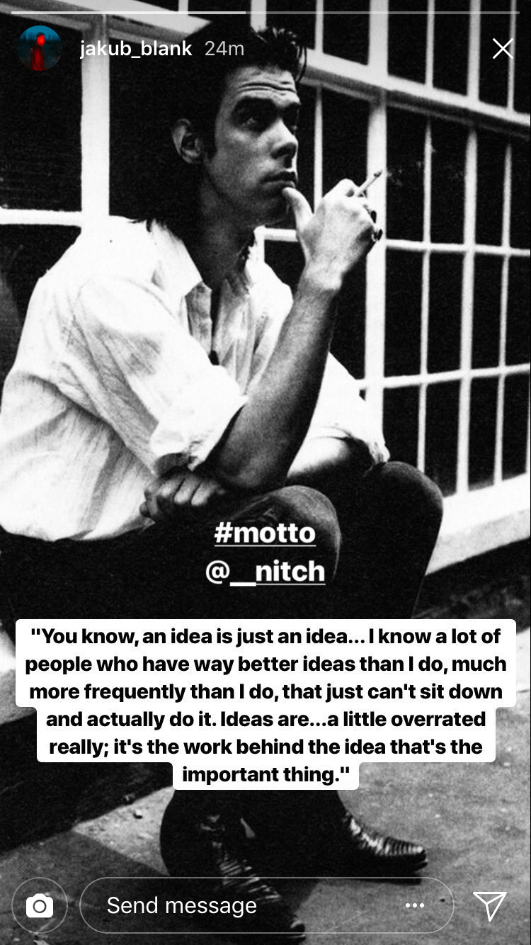
I feel like the trick though is working those ideas and getting them out. A quote came across my Instagram feed recently that was a solid gut punch:

“You know, an idea is just an idea…I know a lot of people who have way better ideas than I do, much more frequently than I do, just that can’t sit down and actually do it. Ideas are…a little overrated really; it’s the work behind the idea that’s the important thing.”

There's also that Linus Pauling line of "The best way to have a good idea is to have a lot of ideas." I see it every time we take The Kid to the Oklahoma Science Museum and it always makes me question what I'm doing with my life...

Fashion Films with Tony Li

Have you guys met Tony Li? You should.

"TONY LI is an American Photographer and Creative with an emphasis in fashion, commercial, editorial, and model development. He is a design graduate of The Art Institute of Dallas with an 11+ year background in the apparel industry ranging from management to visual merchandising." - via thetonyliproject.com

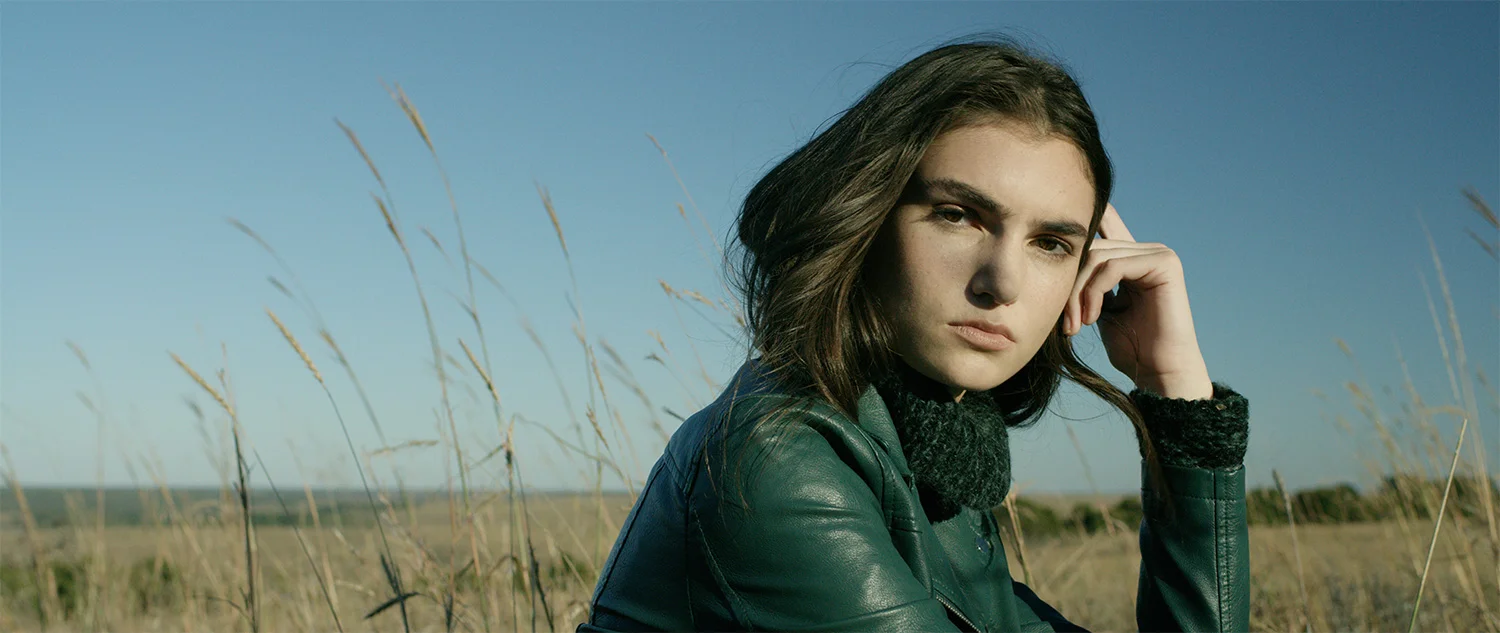
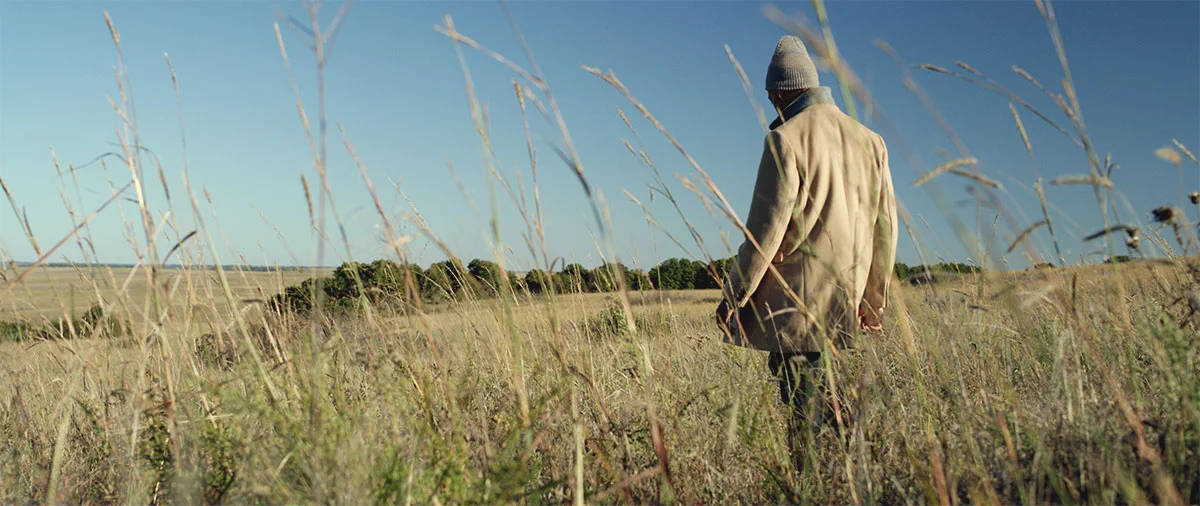
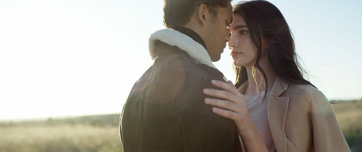
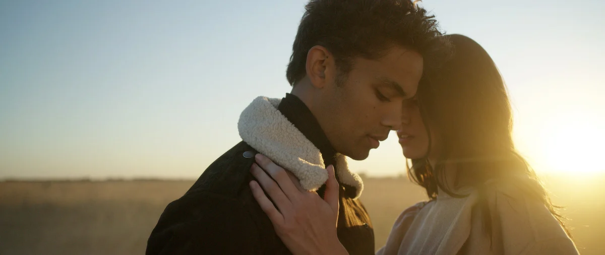
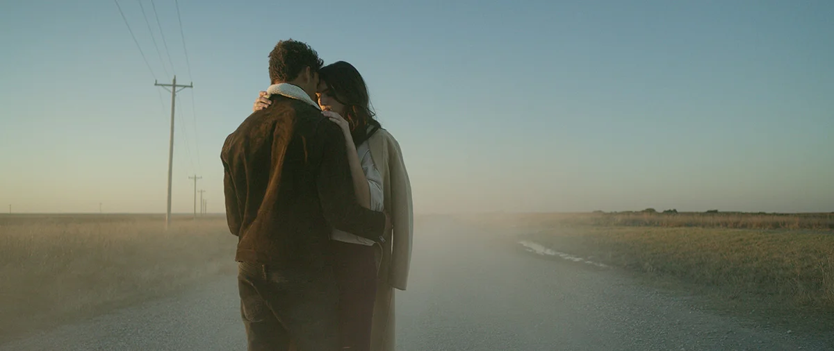
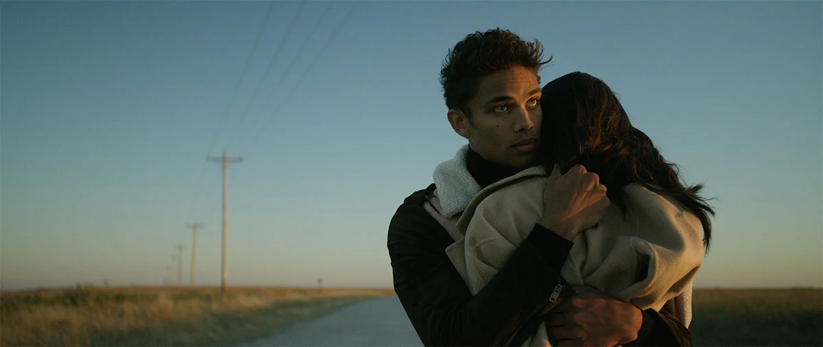
I first caught Tony's work something like 15+ years ago while I was still in school. Luckily we've been able to start working together the last few years. This short fashion film for the Kim Dawson Modeling Agency is probably our biggest collaboration at this point.

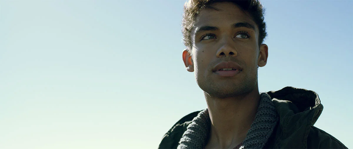
We'd been looking for something to work on together – i.e., me constantly pestering him about shooting something till he wore down. He does a ton of work for the Kim Dawson Agency and they'd reached out about doing a fashion film featuring Cassius Simpson for their 2017 Model Search; That's where I come in. Tony did the heavy lifting with the concept, styling, and putting the team together, then leaned on me and my narrative storytelling experience. I also shot and cut the piece, but we don't have to get into that.

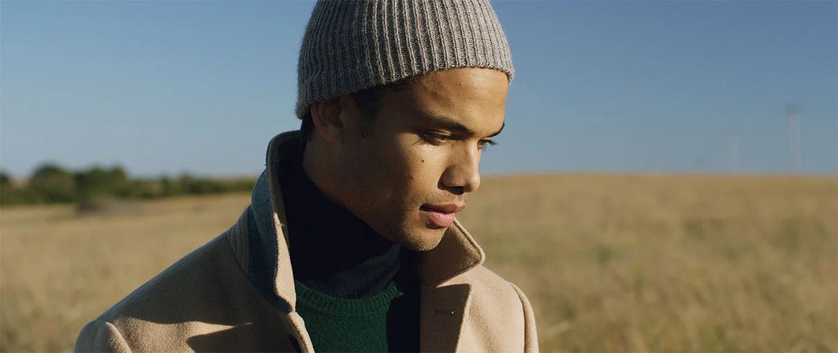
One thing I will mention is how freakin' awesome it is working with on-camera talent who know what they're doing on camera. No disrespect for those I've worked with over the years, but there's an ocean between the talking head pieces with corporate types running major organizations vs. professional models whose livelihood depends on their look and how they deliver on camera. Good lord just look at these beautiful people...

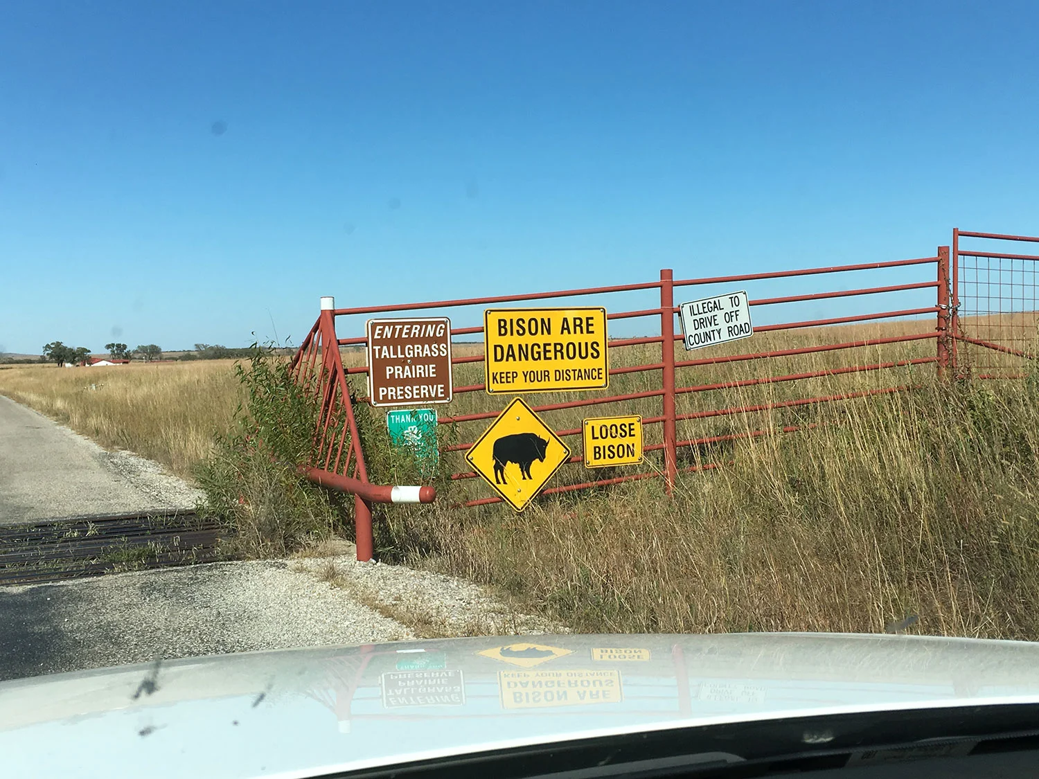
Tony killed it with the location and wardrobe. Seeing as how I wear a limited rotation of hiking pants, t-shirts, and running shoes, there's no need for my fashion input. We'd planned to shoot a few hours in Tulsa and then head out to the Tall Prairie Reserve outside Pawhuska, OK. The shoot somewhat felt cursed seeing as how our main talent's flight got pushed three times and cut our crazy long day in half. We had to nix the Tulsa part of the shoot and just make it up as we went outside civilization in Pawhuska.

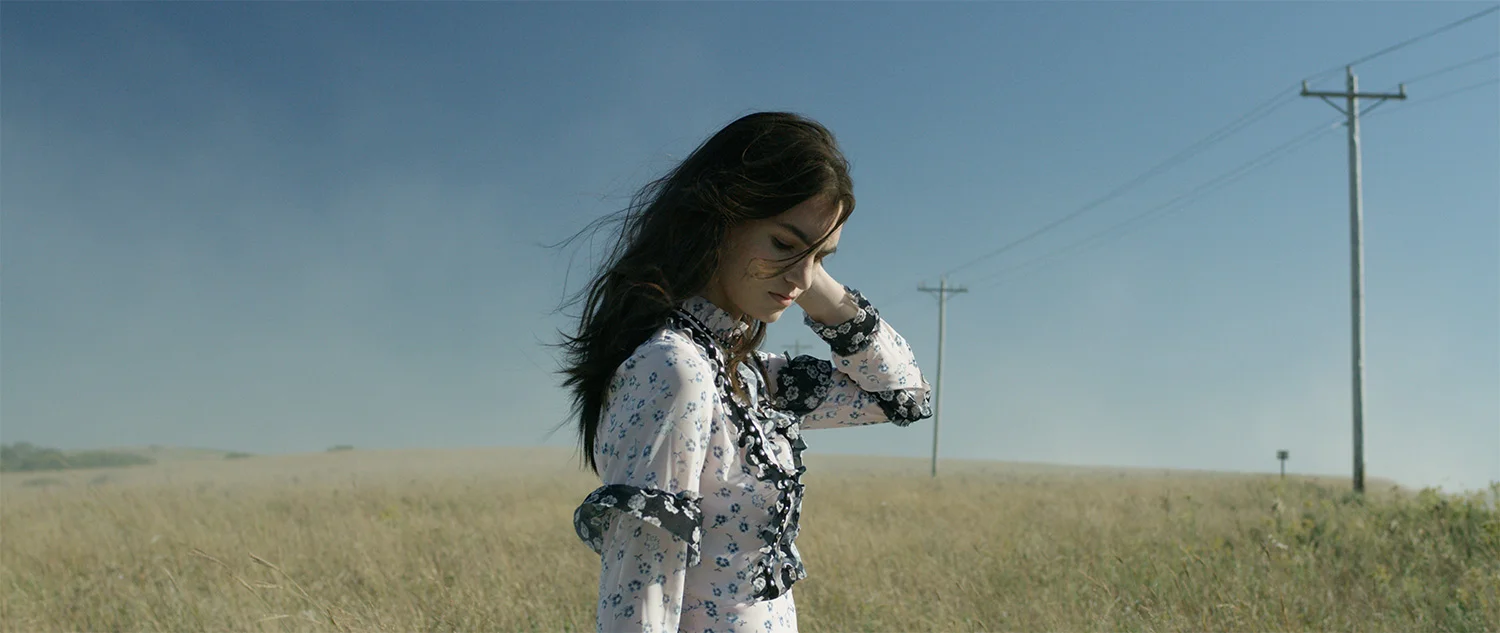
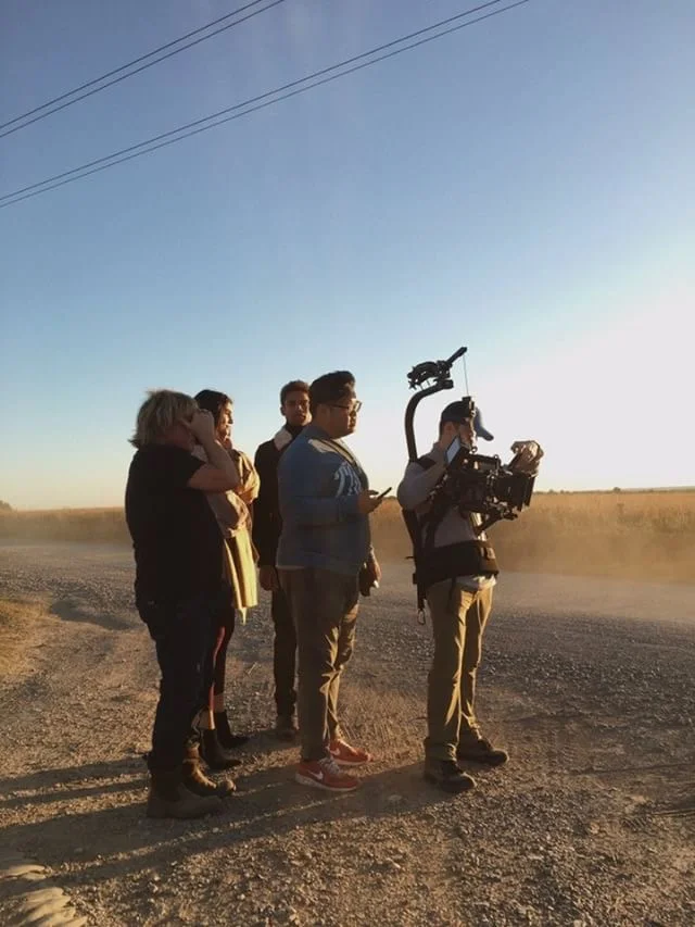
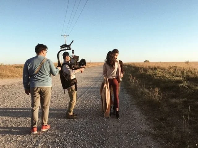
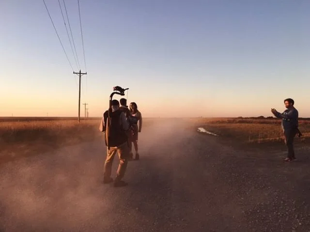
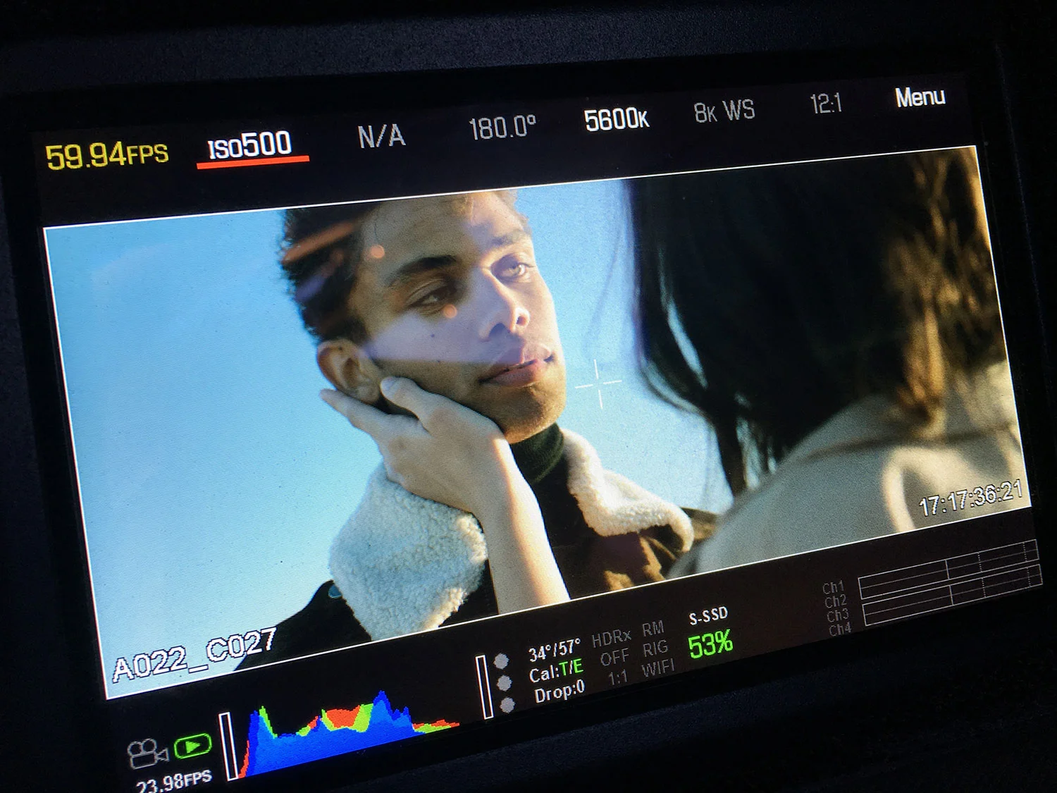
When I can, I try to be crazy intentional in the gear and creative choices made. We shot with my RED Weapon Helium and Zeiss CP.2 lens set (25/35/50/85) – mostly at 8k widescreen at 60 frames/second. Widescreen was a good fit visually for the flat, wide-open location vs. a narrower frame. Going handheld (with a rented EasyRig/Serene Arm setup) let me move quickly from shot to shot and setup to setup vs. the time it would've taken to shuffle around with a tripod and/or dolly setup. Shooting at 60 frames per second gave me the grace to fake smooth-ish-looking camera moves too. We had a couple PAs on set, but anything camera-related was on me. Shoutout to PA Hans for making sweet haze love by stirring up gravel road dust via a gas-powered leaf blower. It made everything look like heaven, but I'm still cleaning that nonsense out of my camera innards.

I will say I beefed it with the polarized filter I was using. I knew we’d be out with big skies filling a good deal of the frame and I was primarily focused on using a polarizer to help deepen the blues. They're basically useless if you're shooting into the sun, but we did get a few shots where it was helpful. The problem though is that I ended up needing to direct a good part of the shoot and move quick to make sure we got what we needed before we lost our light. That being said, making sure my polarizer was in the correct position for each shot was honestly the first ball to drop in the additional responsibilities I was juggling. In some of the pre-dusk frame grabs you can see the darker blues in one corner of the frame thanks to the polarizer not being set properly vs. the more consistent sky color once I stopped using it closer to dusk. My bad…

Post-wise, those freakin' 8k files at a 12:1 compression were monsters. In total, we shot just over a terabyte of footage during the 2-3 hours on set, and this was back before my "oh hey, let's edit with proxy files" days. Thank goodness I've started cutting with proxies so the full-resolution files aren't bogging down my computer as bad. I hate not being able to edit as fast as I can think because I'm waiting for my computer to catch up. Plus I'm not having to pray my shots are in focus because proxies let me watch the clips at a higher playback resolution on my editing timeline. I'd like to take this opportunity to apologize again to my MacPro and Premiere setup; Glad I've matured and seen the light.

CREATIVE DIRECTOR & PRODUCER - Tony Li
DP & EDITOR - me
MODELS - Cassius Simpson & Marisa Harbert
HAIR & MAKEUP - LB Rosser
STYLIST - Tony Li
STYLIST ASSISTANT - Sarah Eliza Roberts.
PRODUCTION ASSISTANT - Hans Kleinschmidt
MUSIC - "Longing" Max LL

SPECIAL THANKS - Kim Dawson Agency, Musicbed, East + West Tulsa, My Mod Mess

Back in NYC

Work last week had me back in New York City for the fourth time since November – that's a personal record for those keeping tabs. The first time I was in NY was the summer of 2002 while on tour with a music group from college and both work and personal travel have kept me going back over the years. I swear I’m slowly getting more and more familiar with the city.

TH_A7495web.jpg

Days one and four of this most recent trip were travel days. Days two and three were spent wearing dress blacks and shooting b-roll of a corporate event in downtown Brooklyn. Crazy thanks to Rik & Heather at Rusty Dog Films for having me out again. They run a Chicago-based production house and I’ve shot for them several times over the last couple of years.

The now beardless David Bizzaro and I met up once I got in town and dropped off my luggage (Side note: go check out his short "The Pits" finally out on Vimeo). We hung out and got coffee near his office space in Dumbo and ended up watching a couple guys choreographing a sword fight with plastic lightsabers.

TH_A7436web.jpg

Afterward, he left for home and I trekked into Manhattan via the Brooklyn Bridge, dodging selfie-taking tourists, runners, and bicyclists along the way. David and I met up again along with his wife in Washington Square Park and then went for dinner at a German spot in the West Village. That night had me falling for this part of the city and spending most of my free time there chasing food and non-tourist traps for the rest of the four-day trip.
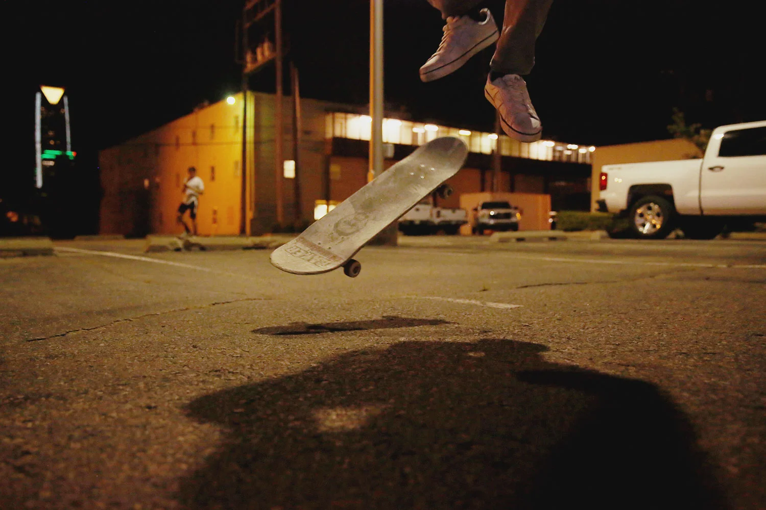
The morning before my flight home got me re-connected with Ed Gungor. He was a pastor, mentor, and boss of mine while I was in Tulsa for undergrad and grad school. He and his wife Gail now live in NYC to be close to their kids/grandkids in the city as well as finish up his Ph.D.

TH_A7476web.jpg

As an outsider spending more and more time in New York City, it feels like a place that's absolutely fine with different ideas. There's the smoosh of all kinds of people getting on and off the subway. There's the huge metal and concrete skyscrapers within walking distance to nice parks with grass and trees. I saw a homeless guy take a full-on piss facing the curb not far from the open-air restaurant full of trust fund kids. That neighborhood sex shop was just as accepting as the children's bookstore and fresh-squeezed juice place it sat between. The more I'm there, the more it feels like the kind of place I'd want to be part of.

A Lighting Test

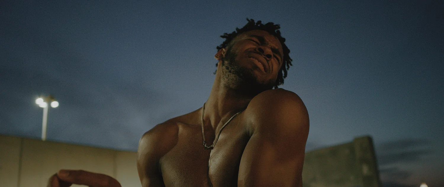
So this was a different thing. By far the most moody and stylized projects I’ve done to date versus what normally fills up my hard drives. I’ve been sitting on a couple reference images for a long time that I absolutely wanted to use but for one reason or another hadn't gotten around to shooting. The whole idea was wrapped around lighting, body structure, and direction. Well, that and my thing of always wanting to do stuff and a goal to post to my blog at least once a week this year.

In putting a treatment together – or at least a lookbook – I dug through a ton of references I’d already had stored away. I’ve also been listening to a TON of Anderson .Paak so I knew his music would be playing a major part. By the way, I'm awful at coming up with titles, so ignore the "Graceful Strength" part if you download the lookbook. This whole thing was more about a lighting test than anything proper. The footage from this film is available for licensing over at Filmsupply.

There were also the self-imposed restrictions of a simple background, using my own equipment (short a couple c-stands and apple boxes), and keeping the talent either seated or lying down. I’d love to talk about my incredible studio space with all its incredible amenities, nice leather couches, and cases of LaCroix Sparkling Water, but instead, I’ll show you my bedroom where I pushed everything up against the walls before the shoot and then reset before St. Anne the Wife got home.
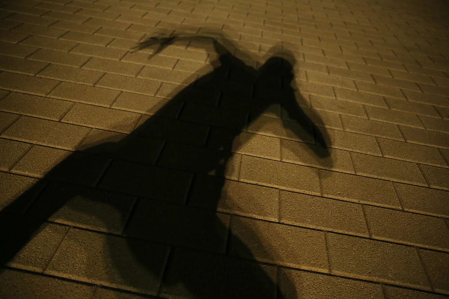
Initially, another model was lined up but I reached out to someone else due to scheduling conflicts. Madison Bready is an OU student I met years ago and worked with a few times recently. Turns out Madi was absolutely the right person for the shoot. Cynthia Dreier is a makeup artist I’ve worked with on quite a few projects and she killed it in making sure Madi looked her best and kept us on track during the shoot. Did I mention Madi is an OU student because we only had like 90 minutes to do makeup and shoot everything in between her classes that afternoon. Oh, and did I mention I was super happy with what we got? Because dang…
Gear-wise, we shot with my RED Weapon Helium at 8k, 60 fps, 2:1 aspect ratio, and 15:1 compression with my Zeiss CP.2 len set (25, 35, & 50). I'd also set my white balance to 4500k to warm up the tungsten light and white backdrop – along with her skin tones and hair color. That being said, all the footage in the edit is straight out of camera; I didn't do any additional color work to the footage (or still frames). I also tried a step printing technique shooting at 8 fps and a 360° shutter angle, but it was in the last couple minutes of the shoot and I wasn’t really happy with the footage; I should’ve shot closer to 4 fps. For lighting, I set up an Arri 650 head through a couple scrims and two layers of diffusion. A bunch of black fabric hung on camera right helped control the spill. I’d roughed in the lighting setup using a styrofoam head on a light stand before the talent got there.

Post-wise, I knew the 8k files were going to be a monster. We shot about 325 GB of footage which isn’t nuts with my camera package, but honestly a pain to edit such large files. Adobe Premiere on my Mac Pro setup will handle it like a champ, but having to lower the playback resolution to 1/8 or 1/16 just to just slog through the .R3D files is like tying that champ’s arm behind his back before going into a fight. I’d worked with offline edits WAY the hell back in the days of SD footage and tape decks, but this simple YouTube tutorial pretty much changed my workflow and is keeping me from looking so longingly at those fancy Alexa Minis and their blissful 4k sensor sizes.

Music is always the hardest part for me during an edit. I promise I’m all about supporting other creatives and paying to license music, but after a genuinely solid effort I couldn’t find or afford something that fit as well – in my opinion – as this Anderson .Paak track. 99% of my edits start with a music track – especially with personal projects; It's got to feel right or else it's not worth the effort.

After I'd gotten somewhat through a rough edit (and several glasses of whiskey) I reached out to a few other creatives for feedback. Crazy thanks to those guys for the insanely solid ideas, helping me step back from how close I was to the work, and look at what I was missing.

Good grief I hope to do more of this soon.

ESPN's Draft Academy 2018

I always trip out seeing something I shot end up seeing the light of day. Back in February, I was contacted by Evolve Studio about filming with one of the players featured in ESPN's Draft Academy 2018 season while he was in Oklahoma City.

DA_frame_1558.jpg

Alabama defensive back Minkah Fitzpatrick was in town to accept the Jim Thorpe Award for the 2017 season and we ended up filming with him for two and a half days. I honestly couldn't say enough nice things about Minkah, the on-site ESPN producer Kristen Lappas, and Evolve Studio. There were some strict "no social media" guidelines and Evolve owned all the footage so I don't have any fancy framegrabs to show short of what is shown in the episode.

ESPN series Draft Academy follows six of the top NFL prospects as they prepare for Draft Day and is exclusively on ESPN+. I've not seen all the episodes at this point, but it looks like the footage from my time with Minkah is in Episode 2: Body & Mind.